Preview image. Unlock full-res
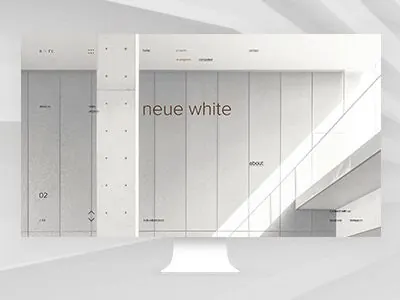
A minimalist web interface mockup with vertical column divisions, centered headline, and monochromatic warm-neutral palette demonstrating high-key typography-forward design.
Summary
A minimalist web interface mockup featuring "neue white" as a centered headline over vertical column divisions and soft geometric background forms, emphasizing negative space and typographic clarity.
Visual description
The design presents a desktop mockup centered on a neutral gray background with subtle diagonal geometric shapes. The interface itself uses an off-white base with vertical column divisions created by light gray strokes. The "neue white" headline is positioned center-right, set in a large sans-serif display face. Two sidebar areas flank the composition: a narrower gray column on the left shows subtle icon/text structure, while the right side features additional text blocks in progressively smaller type. The overall palette is restricted to warm-neutral grays, off-whites, and pale beige, with no color accent. Generous whitespace and horizontal breathing room define the grid structure.
Key takeaway
The vertical-column composition organizing content into distinct zones without visual clutter. The use of soft geometric shapes in the background (diagonal forms) adding subtle visual interest without competing with the type. The discipline of typography-as-primary-design, where scale and placement of type do all the communication work.
Reuse notes
Strong reference for minimalist web design, portfolio sites, or editorial-focused digital products. Works best when you have confident, readable typography at large scale and genuine whitespace budget. The warm-neutral palette prevents it from feeling cold; pairs well with brands emphasizing craft, design process, or premium positioning.