Preview image. Unlock full-res
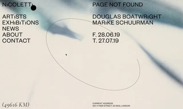
A minimalist website page for an art exhibition, featuring a sparse layout with minimal navigation, curved line drawings, and event information in a refined sans-serif typeface.
Summary
A refined Swiss-inspired exhibition page for Studio 24/24, combining minimal text layout with elegant curved line drawings. The neutral palette and restrained typography convey cultural sophistication.
Visual description
Cream background with a navigation menu on the left (NICOLETTI, ARTISTS, EXHIBITIONS, NEWS, ABOUT, CONTACT) in small dark sans-serif. The center features a large curved line drawing in charcoal gray, with exhibition information and artist names positioned minimally around it. Dates and venue address are set in a refined sans-serif. The overall composition is spacious and relies on negative space.
Key takeaway
Minimal typography and generous spacing can convey sophistication and cultural authority. Curved lines add elegance without decoration.
Reuse notes
Excellent for cultural institutions, museums, and galleries. Use when seeking refined, understated elegance and professional authority. Works best with carefully edited copy and restrained elements.