Preview image. Unlock full-res
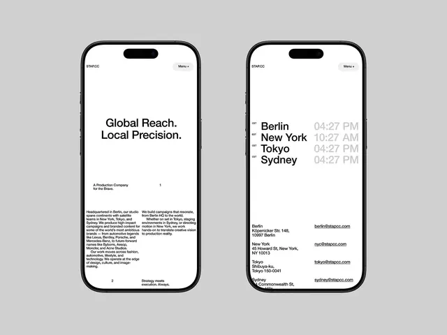
A minimal mobile website concept pairs bold typography with sparse layouts and global office details across two clean iPhone screens.
Summary
A minimal mobile website concept pairs bold typography with sparse layouts and global office details across two clean iPhone screens.
Visual description
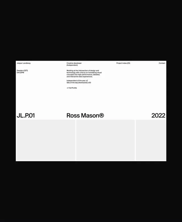
Two mobile UI screens featuring a stark white background and black sans-serif typography. The first screen uses a large, bold headline centered in the upper half with two columns of justified body text below. The second screen displays a list of cities and times in a bold weight, followed by a list of addresses and emails aligned to a strict grid.
Key takeaway
Use a high-contrast, monochromatic palette combined with a rigid grid and generous white space to create a minimalist, architectural feel.
Reuse notes
Reach for this as a ui screen reference. Pairs with typographic, minimal directions. Original by Hrvoje Grubisic.