Preview image. Unlock full-res
E-commerce product page for a Nike sneaker with product photography, specifications, and purchase interface.
Summary
A Nike product e-commerce page displaying the Air Presto Essential sneaker with clean product photography, price, size selectors, and add-to-cart call-to-action in Nike's signature minimal aesthetic.
Visual description
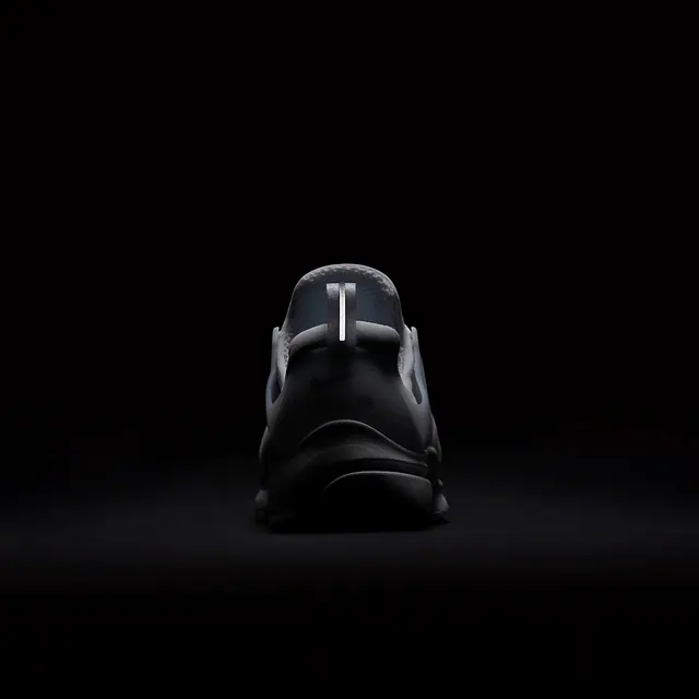
White or near-white background. Large, centered product photography showing the shoe from a clear angle, likely on a neutral ground. The product name "Air Presto Essential" appears as a headline, likely in Nike's house sans-serif. Below: price, size selector (dropdown or button grid), color swatches if available, and a prominent black or colored "Add to Cart" button. Supporting copy includes product description, specifications, or benefits. Navigation elements and account/cart icons sit at the top. Minimal decorative elements; photography does the heavy lifting for visual interest.
Key takeaway
Product-first e-commerce layout. The image gets the most real estate because it's the product. UI elements (selectors, buttons) are organized cleanly below, creating a scan path from image → details → action. This hierarchy works across all product categories.
Reuse notes
Canonical reference for fashion/footwear e-commerce. Study the product photography angle and lighting—it's professional and replicable. The color and size selector UX is standardized here; variations are usually unnecessary. Note the clear visual hierarchy: image > headline > details > CTA button. The black button acts as the final focal point pulling toward purchase. Good for any direct-to-consumer product page. Size selector placement and state changes (selected/available/sold out) are details worth examining closely.