Preview image. Unlock full-res
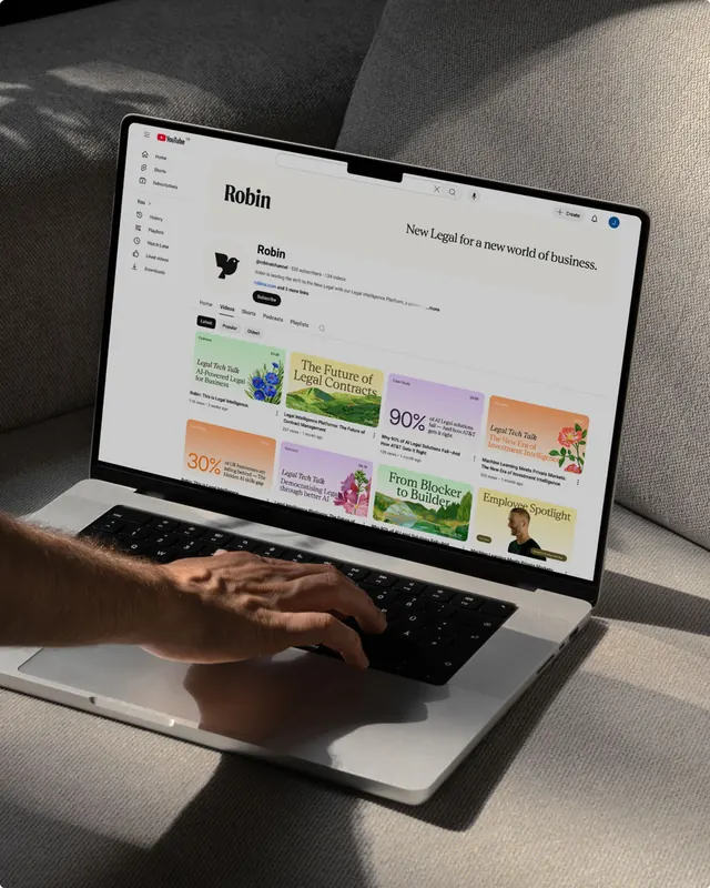
Social network feed layout showing profile cards, text posts, and interaction elements in a clean interface.
Summary
A section of the LinkedIn social feed displaying the card-based layout, profile information, post content, and interactive engagement buttons in LinkedIn's standard corporate design language.
Visual description
White or off-white background. Multiple card elements vertically stacked with subtle separators or shadows. Each card contains a profile header (avatar, name, job title), body text, and a footer row with interaction buttons (Like, Comment, Share, More). Neutral sans-serif type in varying weights and sizes. Light gray secondary text. Action buttons rendered with small icons and text labels, using LinkedIn's signature blue for accents. Overall layout is spacious, left-aligned text with right padding.
Key takeaway
The card pattern's durability. LinkedIn's feed demonstrates how a repeating card unit with consistent internal structure (header, body, footer actions) scales cleanly to a whole page and remains scannable at any density.
Reuse notes
Classic reference for feed UI. Good for understanding card hierarchy and spacing conventions in consumer social products. The neutral gray palette and clean iconography are industry standards for professional networks. Study the interaction button placement and sizing if building your own feed. Note the clear visual distinction between primary content area and action buttons.