Preview image. Unlock full-res
A clean corporate website layout for Bang & Olufsen showcasing product categories (TV, Sound, Speakers, Phones, Digital, Automotive) with product photography grid and brand narrative.
Summary
A professional product showcase website for Bang & Olufsen featuring a grid layout of product categories with photography, descriptive text, and a founder narrative section below.
Visual description
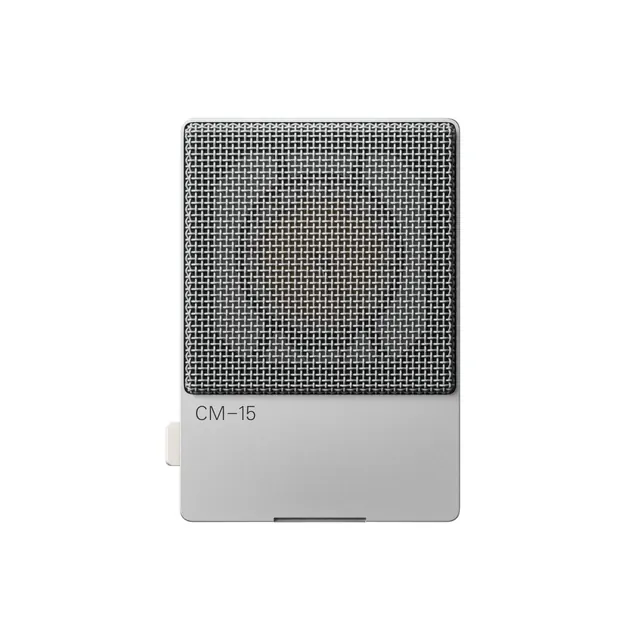
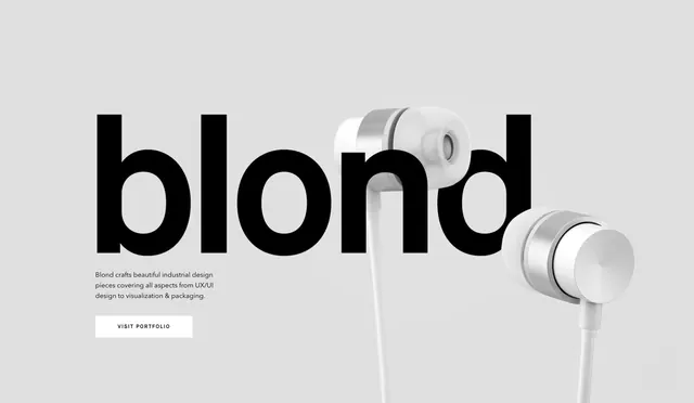
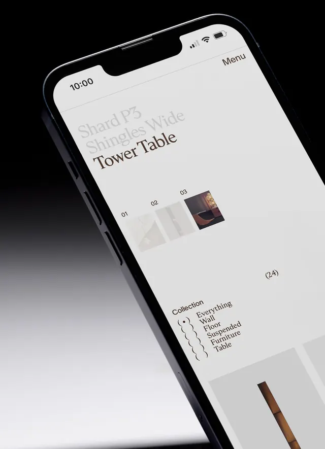
The page has a minimal design on a white and light gray background. At the top is a horizontal navigation menu (TV & VIDEO, SOUND, SPEAKERS, PHONES, DIGITAL, AUTOMOTIVE) with a language selector. Below is a hero section with a lifestyle photo and product mockup. The main content displays six product categories in a 3-column grid, each with a product photograph, category label, and 2-3 lines of descriptive text. Product images include a speaker display, audio equipment setup, headphones, devices, automotive interior, and car exterior. Below the grid is a dark section with a quote and imagery about the founder's philosophy. At the bottom is a footer with product links organized by category. Typography is clean and modern sans-serif, predominantly black text on white/gray backgrounds. Spacing is generous and organized. No heavy colors; relies on photography for visual interest.
Key takeaway
Clean grid-based product showcases work across complex portfolios. Consistent spacing and minimal typography let photography do the communicative work. Balancing product focus with brand narrative creates credibility and context.
Reuse notes
Reference for B2B/luxury product sites or corporate design narratives. The grid layout scales well to different product counts. Works particularly well for premium brands with multiple product lines. The minimal approach emphasizes product quality; ensure high-quality photography to match.