Preview image. Unlock full-res
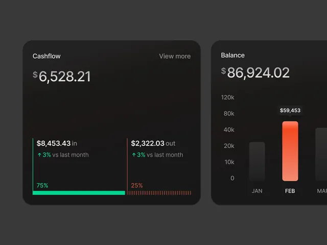
Dark banking interface showing cash flow metrics and account balance with green and red accent bars and a chart visualization.
Summary
A dark-themed banking dashboard featuring two side-by-side metric cards: one displaying cash flow with inbound/outbound transactions and percentage changes, the other showing account balance with a monthly bar chart in bright orange.
Visual description
Dark gray background with rounded card containers. Left card shows "Cashflow" title with two transaction values ($8,453.43 in / $2,322.03 out), each with green and red horizontal progress bars showing 75% and 25% ratios. Right card displays "Balance" with a large account value ($86,924.02), below which sits a vertical bar chart with 3 months (JAN, FEB, MAR) and one prominent orange bar reaching approximately 59k. All text is light gray or white for contrast against the dark background.
Key takeaway
The split card layout and use of color-coded bars (green for positive, red for negative) makes financial data instantly scannable. The clean typography and generous spacing work well for desktop banking interfaces where accuracy and clarity are paramount.
Reuse notes
Strong pattern for fintech dashboards, accounting software, or any data-heavy admin interface. The dark theme reduces eye strain for prolonged use. Works particularly well when data changes frequently and needs to be monitored. Color coding assumes red=outflow, green=inflow (a banking convention).