Preview image. Unlock full-res
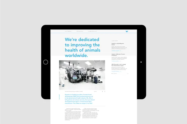
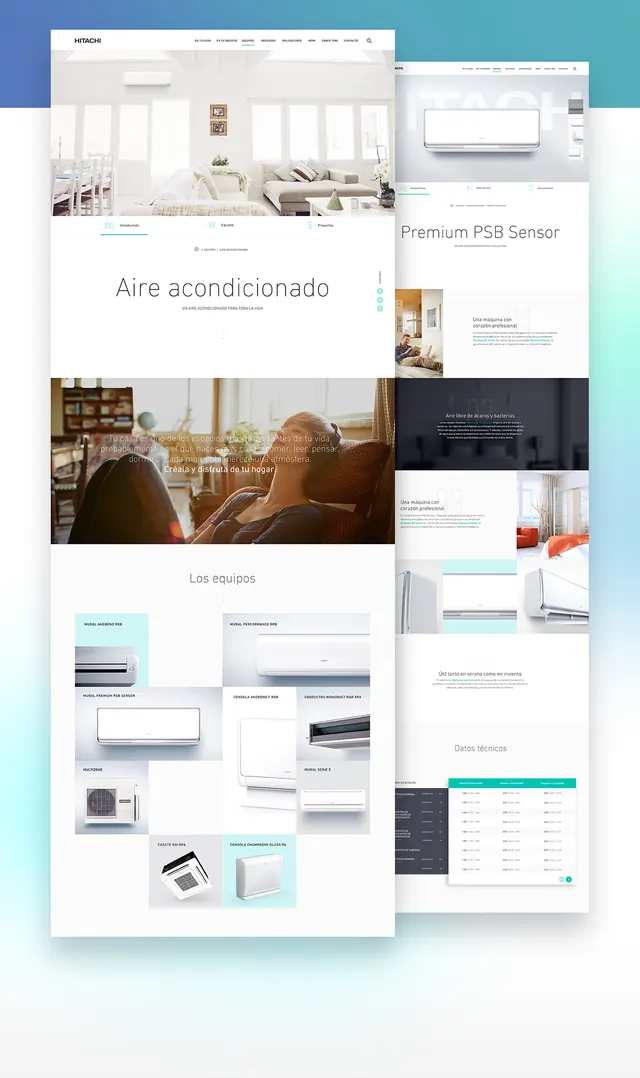
A web design system presentation for an air conditioning brand, showing responsive layouts with clean typography and cyan-to-navy color transitions.
Summary
A comprehensive design system showcase for a corporate air conditioning brand, presenting multiple responsive web page layouts with modular components, product imagery, and a restrained cool-tone palette.
Visual description
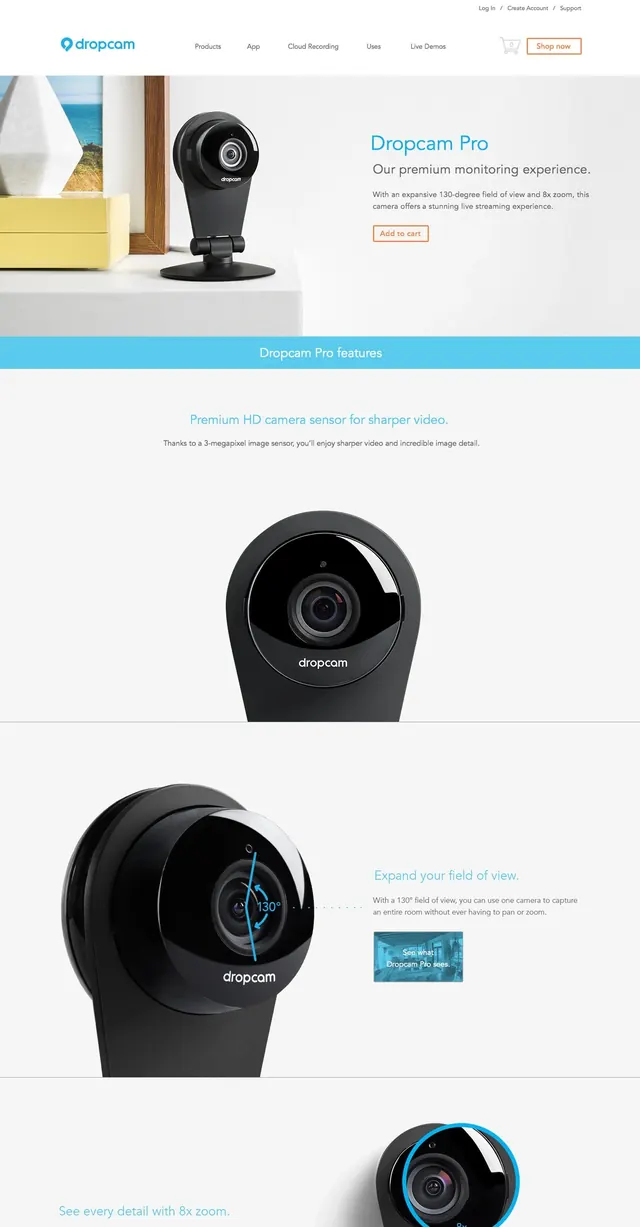
Multiple website mockups and component layouts are arranged in a collage. The design features clean white backgrounds with light gray accents, dark slate blue copy, and bright cyan highlight elements. Page layouts show hero sections with lifestyle photography, product cards in a grid system, specification tables in cyan and charcoal, and a responsive navigation bar. Interior imagery of modern living spaces with air conditioning units is paired with technical product details and control interfaces, creating a cohesive lifestyle-meets-technology narrative.
Key takeaway
The systematic pairing of lifestyle photography with technical product specification, and the use of a single bright accent color (cyan) as a consistent visual anchor across all components to draw attention to key interactions and CTAs.
Reuse notes
A strong template for B2B product websites where emotional lifestyle context needs to sit alongside technical specifications. The modular grid approach works well for manufacturing or appliance brands presenting both consumer benefits and engineering details.