Preview image. Unlock full-res
SaaS performance dashboard mixing funnel metrics, conversational headline-and-anecdote copy blocks, emoji badges, and accent color callouts to explain visibility and accountability features.
Summary
SaaS performance dashboard mixing funnel metrics, conversational headline-and-anecdote copy blocks, emoji badges, and accent color callouts to explain visibility and accountability features.
Visual description
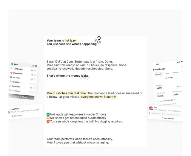
Left sidebar: colored list of lead statuses (Won, Call Booked, Unqualified, No Show, Qualified, New Lead, In Contact) with numeric counts and a clickable "Apply to 4 leads" option. Center: large, conversational copy blocks in bold sans-serif ("Your team is not lazy. You just can't see what's happening.") followed by real-world anecdotes (Sarah, Mike, Jessica examples) and benefit callouts with emoji icons (green checkmark, orange warning, red X) highlighting Mochi's real-time catch. Right sidebar: compact metric panels showing dollar amounts (824.1K, 32.3K, 9.8K) and recent collections, vertically stacked. Monochromatic palette with white backgrounds, gray text, colored accent blocks (green, red, orange) for status emphasis.
Key takeaway
Conversational, story-driven copy (anecdotes about missed handoffs) converts abstract metrics into empathetic motivation. Emoji badges (checkmark, X, warning) provide instant visual categorization without icon design overhead. Condensed sidebar funnel paired with wide center prose creates skimmable hierarchy for mixed analytic + narrative content.
Reuse notes
Excellent for SaaS dashboards, internal tools, and compliance/project-management UIs where numerical accountability pairs with human behavior commentary. Works best when you have a specific pain point (dropped leads, missed deadlines) to tell via anecdote. Avoid for real-time streaming data or high-frequency updates.