Preview image. Unlock full-res
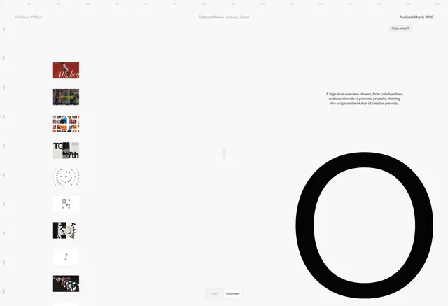
A clean, institutional branding presentation for SMK University featuring monochrome typography and structured layout with professional simplicity.
Summary
A professional branding presentation for an educational institution showing a clean monochrome logo system with structured grid layout and minimal supporting elements.
Visual description
The design features a stark black and white composition with an institutional logo at the center, likely the university's mark. The layout is organized using a clear grid system, with generous white space and aligned typography. Multiple variations or applications of the logo are shown, demonstrating consistency across different scales and contexts. The typeface is a clean, modern sans-serif in a condensed weight. The overall aesthetic is academic and trustworthy, with zero color beyond black, white, and gray.
Key takeaway
Institutional identity thrives with geometric simplicity and consistent grid application. The reduction to pure monochrome makes the logo work as a universal system across all media. The grid structure creates order and professional confidence.
Reuse notes
Strong reference for educational or nonprofit branding systems. The monochrome approach is perfect for applications where budget or reproduction method is limited. The grid layout approach is exemplary for brand guideline presentations. Works as a template for any organization needing clean, scalable identity.