Preview image. Unlock full-res
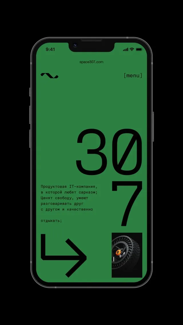
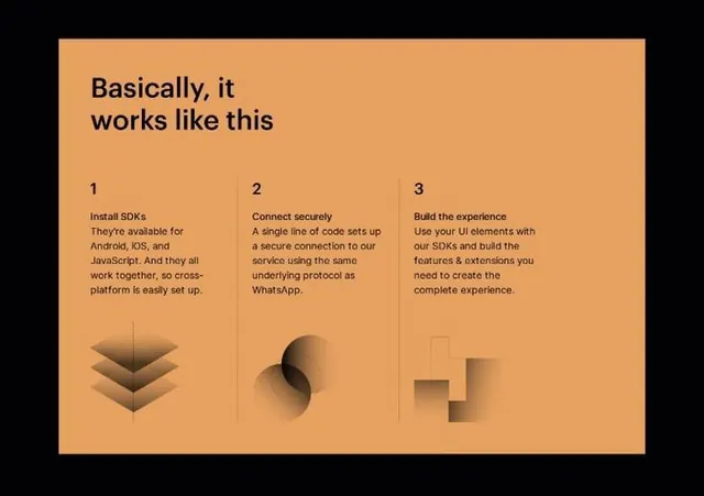
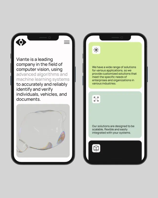
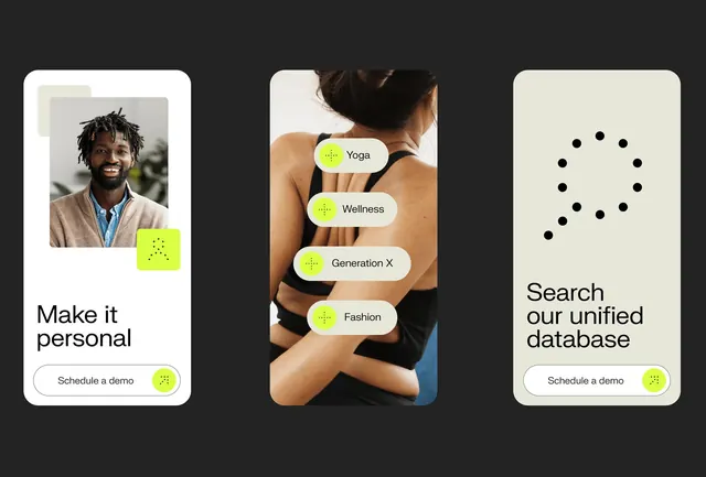
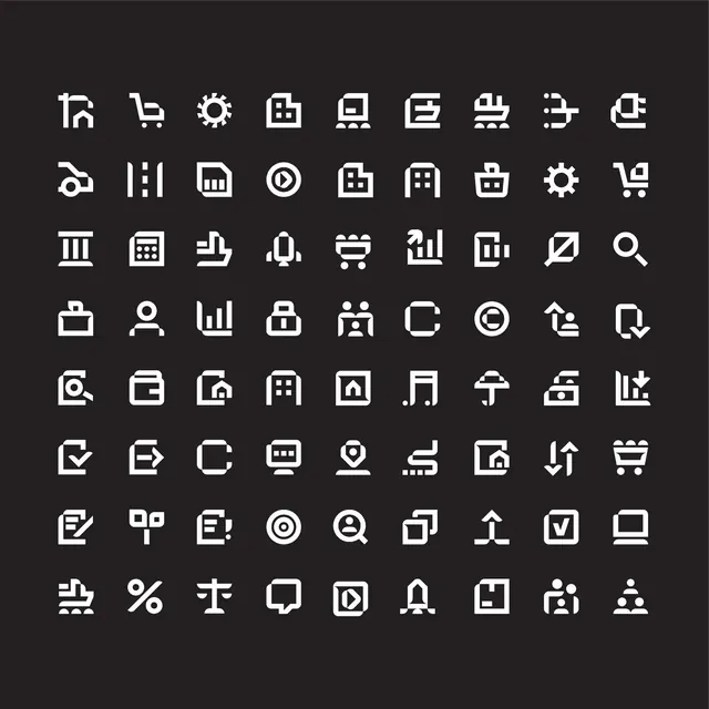
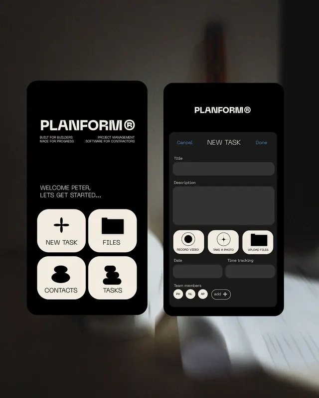
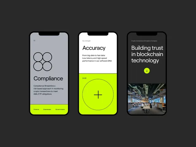
A clean, minimal user interface element or component study featuring geometric simplicity and restrained visual language with neutral color treatment.
Summary
A clean, minimal user interface element or component study featuring geometric simplicity and restrained visual language with neutral color treatment.
Visual description
The composition employs light, neutral color treatment with a minimal, flat, geometric approach. The arrangement demonstrates calm, professional, technical characteristics through disciplined visual composition. The visual language emphasizes ui-screen principles with attention to formal hierarchy and spatial relationships.
Key takeaway
This design demonstrates effective visual communication through consistent application of fundamental principles: clear hierarchy, intentional color use, and refined spacing. The formal restraint creates both visual impact and reusability.
Reuse notes
Valuable reference for projects requiring a ui-screen approach with calm sensibility. Works well in contexts emphasizing calm communication or editorial/professional presentation. The restrained aesthetic pairs effectively with technical or premium brand contexts. Consider the color palette and structural approach when adapting for different industries or applications.