Preview image. Unlock full-res
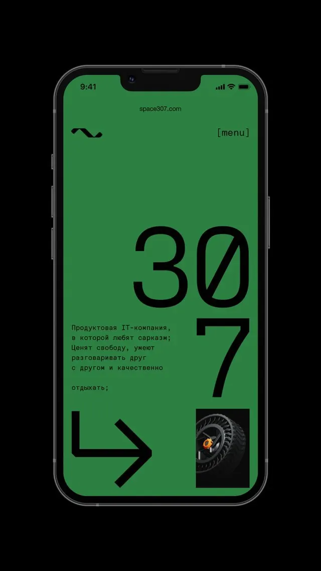
A minimalist mobile app interface with vibrant Kelly green background, bold black oversized numerals, Russian body copy, and geometric accent shapes creating high-contrast visual hierarchy on a single continuous screen.
Summary
A mobile app screen for space307.com with bright Kelly green full-screen background, oversized black numerals ("30" and "7" vertically stacked), Russian body copy, and black geometric arrow and image inset showing product focus and technical credibility.
Visual description
Single mobile phone mockup against a black canvas. The entire screen is filled with bright Kelly green (#2C8042). Top of screen shows time (9:41), status icons, and URL (space307.com) with menu bracket on right. Below, a black curved wavy line logo sits upper left. Centered is Russian body text (4 lines) positioned left of center. The dominant visual element is an oversized black bold "30" with "7" overlapping below it at bottom right, creating a vertical stacked number sequence. At the very bottom: a thick left-pointing arrow chevron and a small inset photograph of a tire with orange/yellow lighting on black. The layout uses extreme whitespace/green space except for the concentrated typography and accents at specific focal points.
Key takeaway
The single-color-saturation approach: a full-screen, single vibrant color with black typography creates maximum readability and visual impact without competing elements. The oversized numerals with intentional overlap creates depth and emphasis without additionalcolor or decoration. The small product photograph (tire close-up) anchored at bottom provides credibility and product context without disrupting the minimalist composition. The black geometric shapes (wavy line, arrow) as purely functional UI elements that double as design accents.
Reuse notes
Excellent reference for tech/developer product interfaces where confidence and clarity matter more than visual warmth. Works best for B2B SaaS, productivity tools, or engineering-focused products. The bright green is memorable and high-energy; pairs with companies wanting to signal innovation or technical sophistication. Russian text is specific to this brand; adapt typography and copy length for other markets. The overlapping number treatment works well for versioning, metric displays, or countdown-style UI. Avoid using this approach with brands that need to feel premium or luxury; the bold flatness reads modern and direct, not refined.