Preview image. Unlock full-res
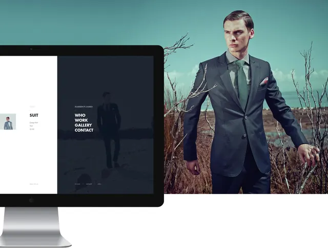
Split-screen fashion website mockup showing portfolio layout with dark navigation panel on left and landscape lifestyle photography of model in tailored suit on right.
Summary
A portfolio website mockup for a bespoke tailoring brand featuring a split-screen design with a dark navigation panel on the left displaying menu items ("SUIT," "WHO WORK," "GALLERY," "CONTACT"), and a full-bleed lifestyle photograph on the right of a model in tailored menswear against a cool teal natural landscape.
Visual description
The layout divides the screen roughly 35/65, with the left panel in dark charcoal/black containing minimal white sans-serif type arranged vertically: navigation labels stacked and left-aligned. The right panel displays a landscape photograph of a man in a well-tailored charcoal suit over a green striped shirt, standing in a surreal desert landscape with dead branches overhead against a teal sky. The composition feels editorial and sophisticated; the figure is positioned center-right, creating breathing room. The color palette is cool and muted: teals, earth tones, dark grays.
Key takeaway
The dark left sidebar creates a strong visual anchor and frames the spacious photography on the right, balancing information hierarchy with visual storytelling. The cool teal sky and muted nature setting convey sophistication and intentional art direction rather than generic product shots. The minimal navigation reinforces the bespoke/curated aesthetic. The split-screen approach works well for portfolio or portfolio-adjacent e-commerce where imagery is the primary draw.
Reuse notes
Excellent reference for luxury, bespoke, or high-end fashion brands. The dark sidebar provides visual contrast and focuses attention on the imagery. The natural/landscape setting for fashion lifestyle shots feels editorial and upscale rather than studio-bound. The cool color palette (teal, gray, muted earth) reads as contemporary luxury; avoid warm or saturated palettes for this aesthetic. The sidebar navigation is elegant for smaller portfolios; ensure font sizes remain readable at small scales. Responsive design will require adjusting the split for mobile.