Preview image. Unlock full-res
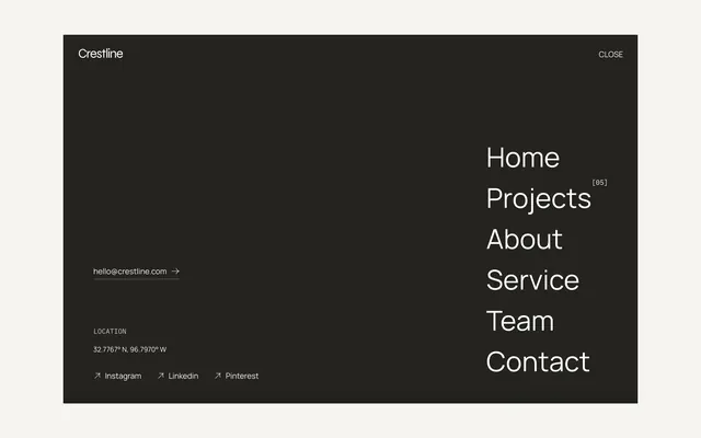
Dark website footer or menu with left-aligned contact info and right-aligned navigation links in minimal sans-serif.
Summary
Dark minimal navigation panel with brand name "Crestline" at top, left-aligned contact email and location coordinates, and right-aligned navigation links (Home, Projects, About, Service, Team, Contact) in large sans-serif type.
Visual description
Black background with off-white type. Left side shows "Crestline" as wordmark, contact link, and location details. Right side displays six navigation items in a vertical stack, each left-aligned. Top right corner has a "CLOSE" button. Social icons (Instagram, LinkedIn, Pinterest) appear at bottom left.
Key takeaway
Splitting navigation across left (contact/brand) and right (primary nav) creates visual balance and hierarchy within a minimal dark interface.
Reuse notes
Ideal for architecture, design, or creative agency footers/menus that need to combine contact info with primary navigation.