Preview image. Unlock full-res
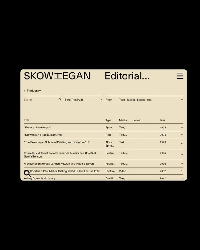
A beige and black library search interface with a sortable table, displaying art-historical archives and institutional collections in minimalist editorial grid.
Summary
A table-based library interface with beige background, black typography, and sortable columns for browsing art-historical archives, exemplifying modernist restraint in institutional digital design.
Visual description
Light beige card with rounded corners on a black background. White header bar with the brand "SKOWHEGAN Editorial..." and hamburger menu. Below: a search field (labeled "Search") with sort dropdown ("Sort: Title (A-Z)"), filter button, and category tabs (Type, Media, Series, Year). The main content is a scrollable table with column headers (Title, Type, Media, Series, Year) and rows of archival items (films, albums, publications, lectures, oral histories) spanning dates from 1979 to 2025. A small avatar icon appears on one row. Monochromatic palette, strict alignment, minimal visual noise. Typography is a clean sans-serif throughout, size-differentiated for hierarchy.
Key takeaway
The controlled restraint in organizing complex information: heavy use of whitespace, aligned columns with breathing room, and restrained typography hierarchy lets the content speak. The dropdown and tab-based filtering pattern keeps the interface uncluttered while surfacing facets. Beige-on-black color choice gives institutional gravitas without coldness.
Reuse notes
Strong reference for museum, gallery, archive, and cultural-institution digital collections. Works well for browsing taxonomies without visual distraction. The monochromatic palette fits educational and scholarly contexts. Tabbed filtering pairs well with searchable catalogs and digital libraries.