Preview image. Unlock full-res
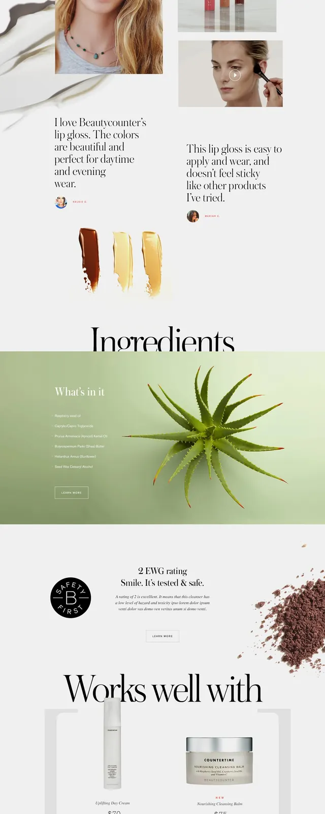
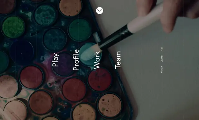
Ecommerce website showing a grid of makeup product jars in natural lighting, overlaid with a clean navigation menu and product categories.
Summary
A cosmetics brand website with a hero image of makeup products arranged in warm tones, topped with a minimal horizontal navigation menu featuring links to Play, Profile, Work, and Team sections.
Visual description
Background is a tight grid of makeup jars and pots in earthy warm tones—terracotta, rose, brown, and gold. The arrangement suggests artisanal, handmade products. A hand holding a makeup brush appears in the frame. Overlaid at top center is a clean, minimal navigation menu in white sans-serif type: a small heart icon, then the words "Play," "Profile," "Work," "Team," with dashes between sections. The menu uses ample whitespace and has a quiet, considered aesthetic. The composition balances the detailed product photography below with the minimalist typography above, creating visual hierarchy through restraint.
Key takeaway
How a minimal, well-spaced navigation can feel premium when placed over rich product photography. The earthy color palette of the products is allowed to breathe with simple black type. The "hand with brush" human element adds warmth to what could otherwise feel sterile.
Reuse notes
Good reference for beauty, cosmetics, or artisanal product brands that want to feel premium without being cold or corporate. The product-grid-as-background approach works especially well for handmade or craft-adjacent brands. The navigation style is reusable for small portfolio sites or fashion brands.
Routed to: UI & Product (ecommerce/product showcase)