Preview image. Unlock full-res
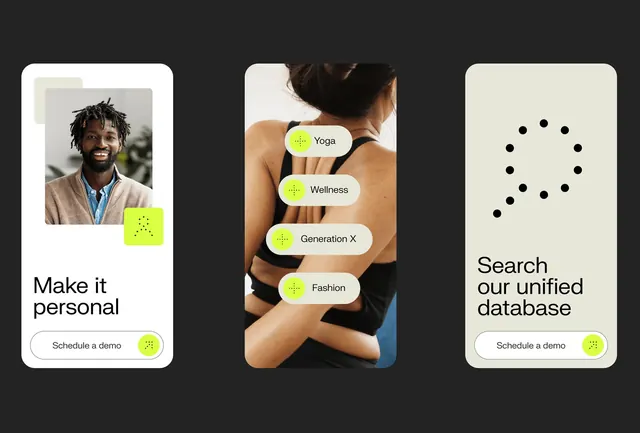
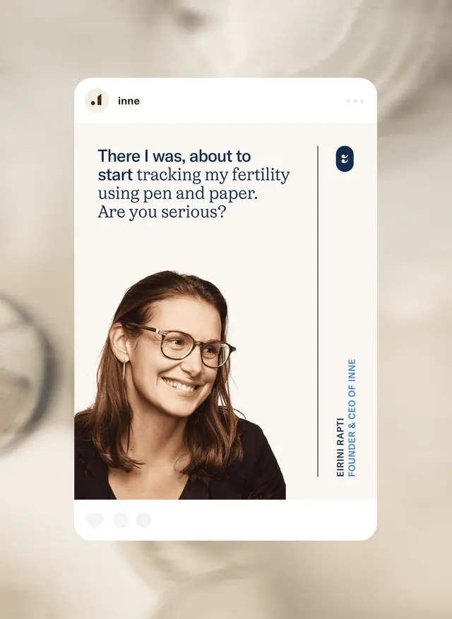
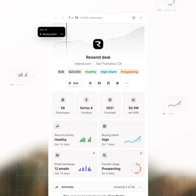
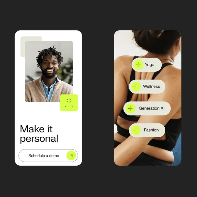
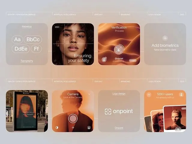
A grid-based layout featuring rounded rectangular cards in warm earthy tones displaying various product features and interface elements.

Summary
A warm, earthy-toned product showcase grid displaying app features through rounded cards arranged in two rows, mixing product photography, interface elements, and feature descriptions.
Visual description
Light beige background. Multiple rounded rectangular cards in warm terracotta, cream, and tan tones arranged in a 2x4 grid. Top row shows typography samples, a face photo with "Ensuring your safety" text, an orange verification process card, and biometrics feature. Bottom row displays photography, camera interface, logo design example, and user count callout. All cards maintain consistent border radius and hierarchy through color variation.
Key takeaway
The effective use of warm, muted earth tones to create a cohesive product showcase. Rounded corners soften the grid structure while varied card content types (images, text, icons) maintain visual interest without clutter.
Reuse notes
Strong template for SaaS apps, health/wellness products, or fintech interfaces wanting to convey safety and warmth. The color palette works well for premium-feeling apps targeting users looking for trust. Card-based layout scales well for feature showcases.