Preview image. Unlock full-res
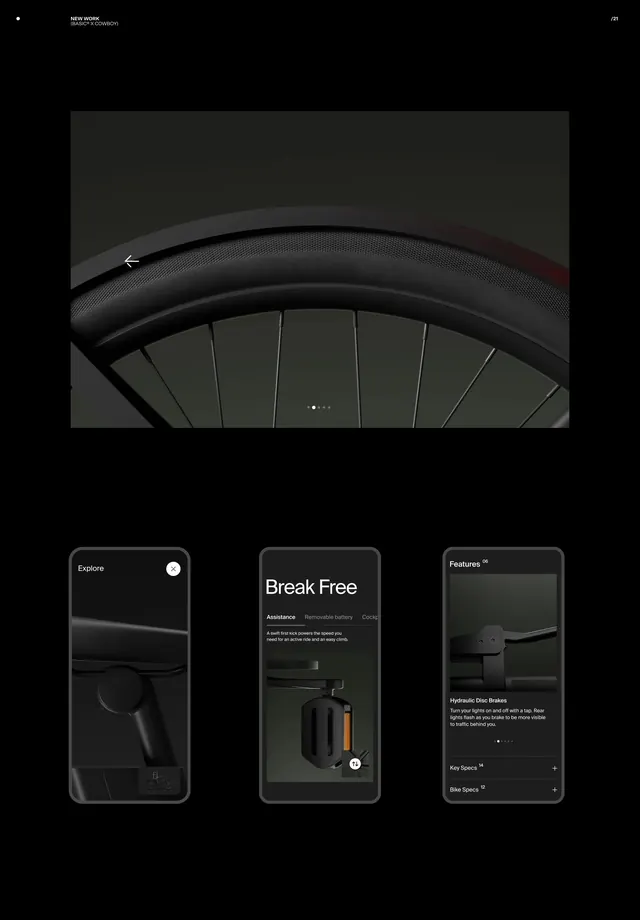
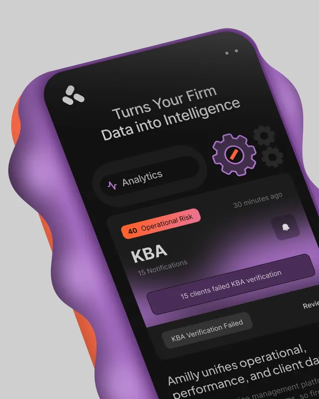
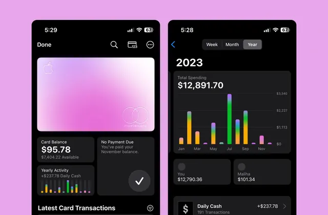
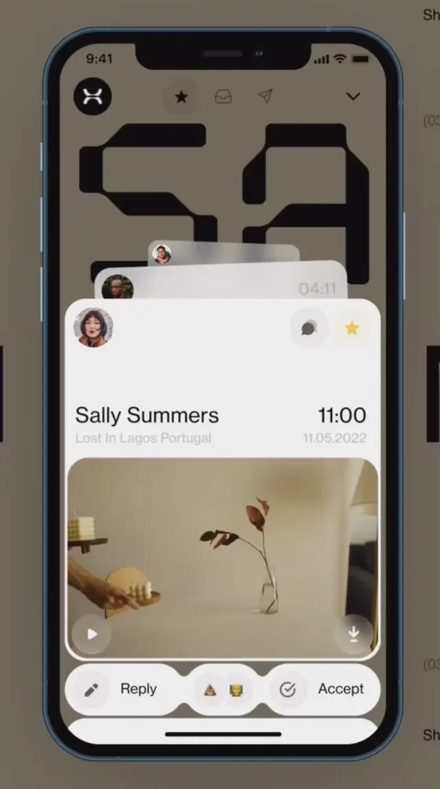
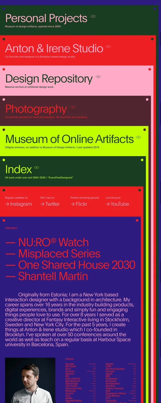
A dark-mode mobile app interface with a gradient-accented call-to-action button and clean typography hierarchy.
Summary
A dark-mode mobile application screen featuring clean typography, ample whitespace (actually blackspace), and a prominent gradient-accented button in pink and mauve tones.
Visual description
Deep black background (#1A1A1A) with white text (#FFFFFF) in sans-serif font. The layout is centered and uncluttered, with generous vertical spacing between elements. A large gradient button commands attention, transitioning from hot pink (#FF6B9D) to a deeper mauve (#C06C84). Secondary text appears in a lighter gray tone for hierarchy. No decorative imagery; purely typographic and functional. The design language is contemporary and premium.
Key takeaway
The power of dark mode combined with strategic use of a warm gradient accent. The restraint in the rest of the interface makes the button unmissable. Dark interfaces convey sophistication and reduce cognitive load.
Reuse notes
Strong template for premium SaaS products, modern consumer apps, or any brand with a tech-forward positioning. The dark background works well for late-night usage (less eye strain). The gradient button is a premium detail that elevates the perceived value. Easy to theme and adapt.