Preview image. Unlock full-res
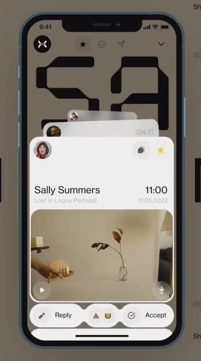
A dark-mode mobile interface showing a profile card with contact name and time, followed by a photo and interactive action buttons (reply, emoji, accept).
Summary
A dark-mode mobile interface displaying a contact profile card with name, timestamp, a photo of dried flowers in a vase, and three action buttons for reply, emoji response, and acceptance.
Visual description
The interface shows a smartphone displaying a stacked dark composition. At the top, a dark gray bar contains the status icons and time (9:41). Below that are faint geometric shapes (possibly conversation bubbles or previous messages) in charcoal gray. The main content area features a light beige card with a profile section showing "Sally Summers" and "11:00" aligned left, with "11.05.2025" as a date on the right. Below this is a warm-toned photograph of dried botanical stems in a clear vase against a soft beige wall. A white action bar at the bottom contains three buttons: a pencil icon (reply), the letter "A" in a circle (emoji/text), and an accept checkmark, with subtle yellow and orange accents on the rightmost elements. The overall contrast is high between dark grays and whites, with warm sandy accents providing visual interest.
Key takeaway
The minimal but functional action bar keeps interactions clear without overshadowing the photo content. The subtle typography hierarchy (name and time) combined with a visual break before the photo creates natural scanning flow. The warm, muted color palette on the card (beige, tan) contrasts effectively against the dark background while maintaining readability and a calm aesthetic.
Reuse notes
Strong template for messaging apps, social platforms with photo sharing, or contact-management interfaces. The dark-mode treatment reduces visual fatigue for frequent users. The three-button action bar is flexible enough for different call-to-action combinations (reply, react, save, share). The botanical photo works well for lifestyle or intimate-scale applications; swap in product photos for commerce or service-based use cases. The neutral color scheme adapts easily to brand accents by adjusting the highlight or button colors.