Preview image. Unlock full-res
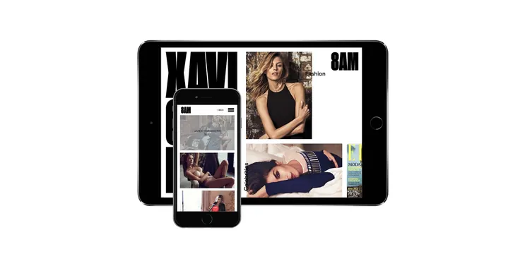
Fashion brand 8AM responsive web UI displayed across iPhone and iPad showing product gallery and model photography.
Summary
A responsive web interface for fashion brand 8AM displayed on iPhone and iPad devices. The design showcases model photography and product galleries in a clean, minimal layout across multiple screen sizes.
Visual description
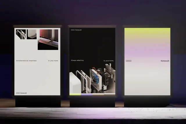
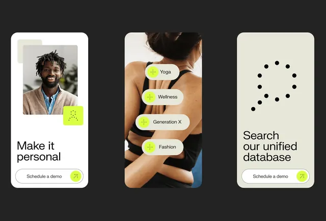
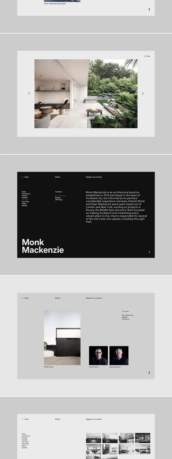
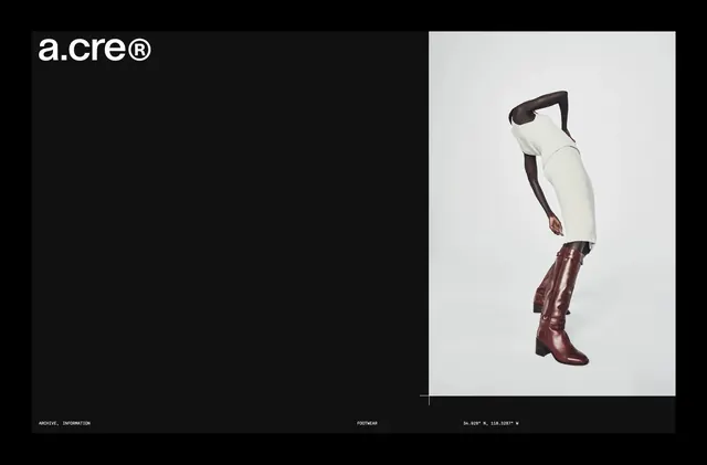
The mockup displays two Apple devices. The iPad shows a split-column layout with large model portrait photography on the right and a vertical product/image gallery strip on the left. The iPhone below shows the mobile version with a condensed stacked layout. Both use a neutral black and white color scheme with clean sans-serif typography. Model photos are prominently featured with high contrast against white backgrounds. A magazine cover (MODA) appears as an accent element.
Key takeaway
Demonstrates effective responsive design that scales visual hierarchy from mobile to tablet. The split-column layout on tablet leverages the larger screen while the stacked mobile layout maintains focus. Clean typography and high-contrast imagery create an upscale, editorial feel.
Reuse notes
Works well for fashion, retail, or portfolio sites where imagery is the hero. The responsive structure shown is adaptable for product-heavy brands. White space and clean typography keep the focus on photography. Ensure images are high-quality and consistent in treatment across breakpoints.