Preview image. Unlock full-res
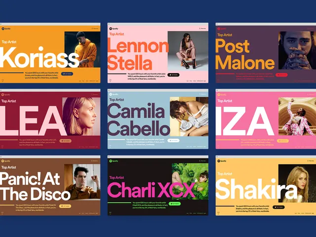
Grid layout of nine Spotify "Top Artist" cards with vibrant colored backgrounds featuring artist portraits.
Summary
A vibrant 3x3 grid of Spotify "Top Artist" cards from the 2018 Wrapped campaign, each with a unique bright background color, artist name, and portrait photo.
Visual description
Nine rectangular cards arranged in a 3-column grid. Each card has a distinct vibrant background color (orange, pink, magenta, maroon, light blue, etc.) with Spotify branding at top. Card content includes: large white or contrasting "Top Artist" label, bold oversized artist name in white or colored type, portrait or lifestyle photo of the artist, small descriptive text below, and a colored action button ("Get Started"). The color palette spans warm (oranges, pinks) and cool (blues, purples) tones. Composition is modern, playful, and highly visual.
Key takeaway
Demonstrates effective use of vibrant, contrasting background colors to differentiate similar cards in a grid. Each color choice aligns with the artist/brand personality. Shows how bold typography and photography can work together in a contained card format. The consistent structure with varied colors keeps the grid interesting without overwhelming.
Reuse notes
Excellent template for music, entertainment, or consumer-facing apps requiring artist/profile showcases. Works well for campaigns, year-end recaps, or discovery features. The 3-column grid scales to responsive layouts. Each card is self-contained, making it easy to customize colors per content. Vibrant backgrounds pair well with clean typography and strong imagery.