Preview image. Unlock full-res
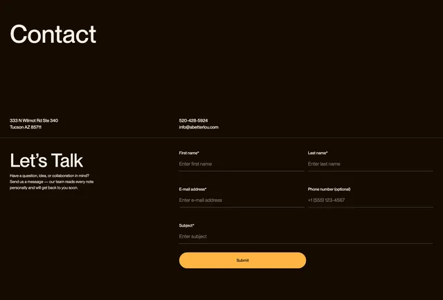
Dark contact section with oversized heading, address and phone details, and a split layout pairing invitation copy with a minimal underline form.
Summary
A high-contrast dark contact page with a dominant "Contact" heading, inline address and phone details, and a two-column lower band splitting persuasive copy from a five-field inquiry form.
Visual description
Very dark warm-brown background spans the full section. Top left shows an oversized bold white "Contact" heading. Below it, a row splits address on the left ("333 N Wilmot Rd Ste 340, Tucson AZ 85711") from phone and email on the right ("520-428-5924" and "info@abetterlou.com") in smaller white sans-serif. A thin horizontal rule divides the upper details from the lower content. Bottom left carries a "Let's Talk" subheading and a short paragraph inviting questions and collaboration. Bottom right holds a vertical form with five underline-style fields: First name, Last name, E-mail address, Phone number (optional), and Subject, each with a light placeholder and thin white bottom border only. A full-width orange pill "Submit" button with dark text caps the form.
Key takeaway
Contact details stay above the fold in a simple two-column row before the form, so visitors see location and phone without scrolling past inputs. Underline-only fields keep the dark layout airy while the wide orange submit pill anchors the action.
Reuse notes
Suits premium healthcare or professional services that want a personal, uncluttered inquiry flow. The dark field treatment needs strong label contrast and visible focus states. Works best when five or fewer fields keep the right column from feeling long.