Preview image. Unlock full-res
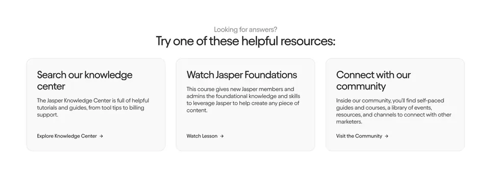
Centered "looking for answers" prompt above three equal light-grey resource cards linking to help, a course, and community.
Summary
A self-serve support block: a small muted eyebrow and a centered heading sit above three identical light-grey cards that route visitors to the knowledge center, a foundations course, and the community. It reads as a contact section that deflects to resources before a human.
Visual description
Centered at the top, a small grey "Looking for answers?" eyebrow leads a larger black sans-serif heading, "Try one of these helpful resources:". Below, three equal-width rounded cards on a near-white background each hold a two-line bold title, a short paragraph, and a text link with a right arrow ("Explore Knowledge Center", "Watch Lesson", "Visit the Community"). Cards share consistent padding and a soft grey fill with no icons or imagery, keeping the focus on the copy and link.
Key takeaway
Treating "contact" as a deflection moment, offering three self-serve paths before a support form, is an efficient pattern for reducing ticket volume. The three-card symmetry with arrow text links keeps it light and scannable without buttons competing for attention. The muted card fill lets the section sit quietly on a help or contact page.
Reuse notes
Use near a contact form or in a help center landing to steer users toward self-service first. Pairs well above a "still need help?" form or footer contact line. Keep the three options genuinely distinct; if the cards say similar things the symmetry stops helping.