Preview image. Unlock full-res
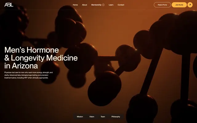
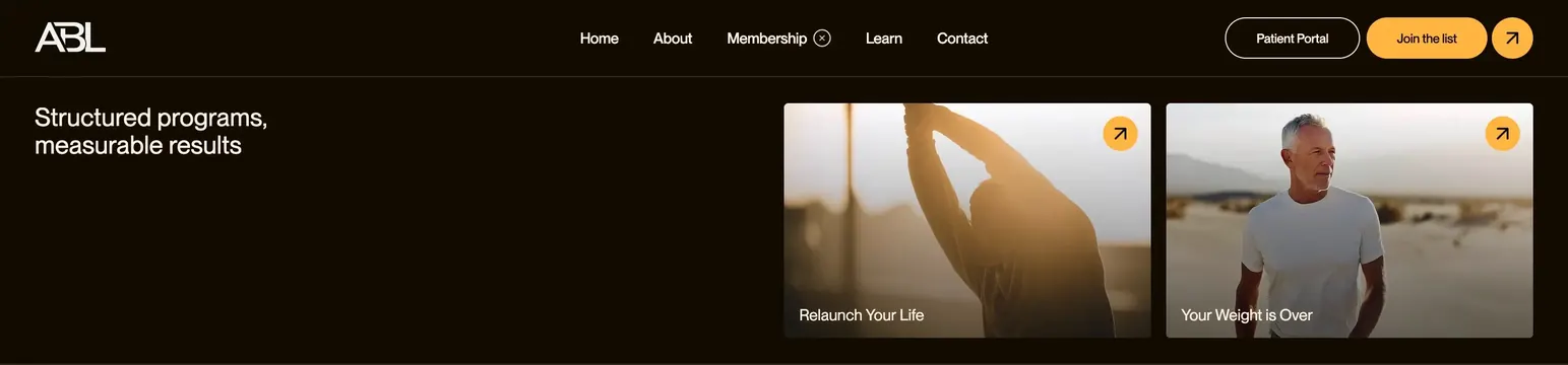
Dark minimal navbar with centered nav links, dual CTAs, and a split hero below featuring two rounded image program cards.
Summary
A near-black health site header with a centered link row, orange primary CTA, and a hero strip beneath pairing a left headline with two side-by-side photographic program cards.
Visual description
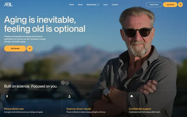
The top bar spans full width on a dark warm-brown background. White "ABL" wordmark sits left; centered nav links read Home, About, Membership (with a small x icon), Learn, and Contact in light sans-serif. Right side holds a ghost-outline "Patient Portal" button, a solid orange "Join the list" pill, and a small circular orange button with a black up-right arrow. Below, the left column shows a medium-weight white headline "Structured programs, measurable results" with generous negative space. The right holds two equal rounded-corner cards: the left card shows a person stretching in warm sunlight with "Relaunch Your Life" label and an orange arrow circle top-right; the right card shows a man in a white tee against desert hills with "Your Weight is Over" and a matching arrow icon.
Key takeaway
The navbar keeps navigation minimal while giving two distinct CTA treatments (ghost portal link plus loud join button). The hero below extends the header into actionable program cards without changing the dark palette or orange accent system.
Reuse notes
Works for healthcare or wellness brands offering multiple programs. The dual image cards need strong photography and short program names. Orange accent must stay consistent across buttons and card icons for the pattern to read as one system.