Preview image. Unlock full-res
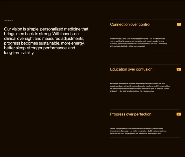
Dark two-column vision section with oversized white intro copy left and three numbered orange principle rows right.
Summary
A dark men's health vision block pairing a large white mission paragraph on the left with three numbered principle cards on the right, each separated by thin horizontal rules.
Visual description
Deep dark brown background fills the section. Top left shows a small uppercase white label "OUR VISION". Below it, a large bold white sans-serif paragraph states the brand vision around personalized medicine for men. Right column lists three items stacked vertically with thin divider lines between them. Each item has an orange bold title on the left ("Connection over control", "Education over confusion", "Progress over perfection"), a small orange square badge with a white number (1, 2, 3) on the far right, and a short white body paragraph beneath the title. Orange accent color repeats on titles and number badges against the dark field.
Key takeaway
The numbered orange square badges give ordered principles a distinct identity without icons or photography. Keeping one oversized manifesto paragraph opposite a structured list balances emotional copy with scannable proof points.
Reuse notes
Useful for healthcare or wellness brands explaining philosophy before product detail. Needs strong contrast between accent orange and the dark background. Best when three to four principles can stay concise under consistent row structure.