Preview image. Unlock full-res
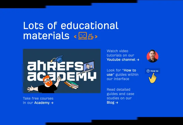
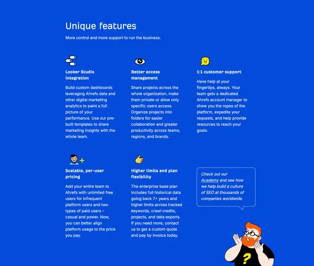
Blue enterprise features section with a left-aligned heading and a three-column grid of icon-led feature blocks plus an Academy CTA with character illustration.
Summary
A full-width features block on Ahrefs blue listing five enterprise differentiators in a loose three-column grid, with a sixth cell combining an Academy speech-bubble link and a surprised character illustration.
Visual description
Solid blue background with white sans-serif type throughout. Top-left section header: large "Unique features" title and smaller subhead "More control and more support to run the business." Below, a grid of five feature cells, each with a small flat sticker-style icon, bold white title, and paragraph of lighter white body copy. Features shown: Looker Studio integration (stacked capsule icon), Better access management (eye icon), 1:1 customer support (yellow smiley speech bubble), Scalable per-user pricing (head with green plus), Higher limits and plan flexibility (yellow thumbs-up). Bottom-right cell breaks the pattern: white-outlined blue speech bubble with italic copy linking "Academy" underlined, above an orange-haired character in glasses and black tee with yellow question mark, hands raised in a questioning pose. No cards or borders between cells; spacing and alignment define the grid.
Key takeaway
Treating one grid slot as a soft secondary CTA (Academy link in a speech bubble plus mascot) so the features list ends with education instead of another bullet. Sticker icons at small scale keep a dense enterprise page from feeling like a generic icon-font grid.
Reuse notes
Works on mid-page enterprise tiers where differentiation is operational (support, access, pricing model) rather than feature screenshots. The mascot corner adds personality without a full illustration break. Less suited to products that need UI proof in every cell.