Preview image. Unlock full-res
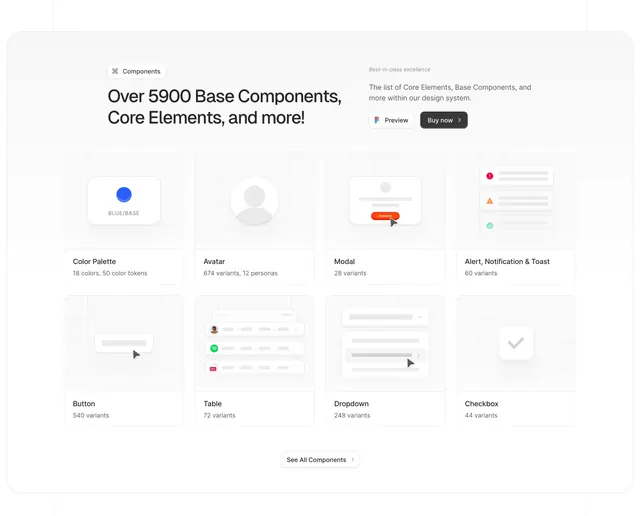
Light boxed features section with a components badge, large headline, dual CTAs, and an eight-card grid previewing UI kit categories with variant counts.
Summary
A rounded white container promoting a large UI component library through an eight-tile preview grid, each card showing a mini mockup and variant count for categories like buttons, modals, and tables.
Visual description
Large white section with generous border radius on a light grey page background. Top left, a small pill badge with a command icon and the label "Components". Below, a bold black headline reads "Over 5900 Base Components, Core Elements, and more!" Top right, a subheading "Best-in-class excellence" with short supporting copy and two buttons: a white "Preview" button with a Figma icon and a dark grey "Buy now >" pill. Below, a four-by-two grid of cards. Each card splits into a light grey grid-pattern preview area and a bottom label with variant stats: Color Palette (18 colors, 50 tokens), Avatar (674 variants), Modal (28 variants), Alert/Notification/Toast (60 variants), Button (540 variants), Table (72 variants), Dropdown (248 variants), and Checkbox (44 variants). Previews use accent colors (blue, orange, red, green) on neutral UI chrome. Centered footer link reads "See All Components >".
Key takeaway
Leading with total library scale in the headline, then proving breadth through eight categorized tiles with concrete variant counts. The split card structure (visual preview plus stats) makes a dense catalog feel scannable.
Reuse notes
Strong reference for Figma kits, design systems, or component marketplaces. Works when each category has a recognizable mini-demo and a number that signals depth. The eight-tile grid assumes desktop width; mobile should collapse to two columns or a carousel.