Preview image. Unlock full-res
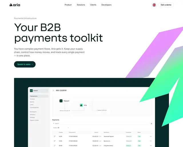
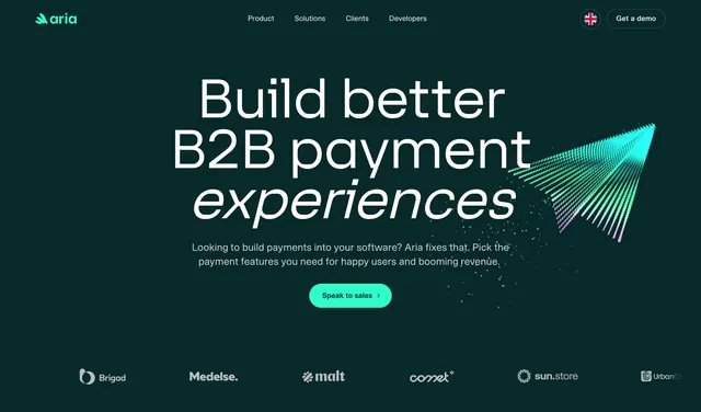
Dark centered hero with an oversized headline, mixed upright and italic type, a green pill CTA, a particle graphic, and a partner logo strip.
Summary
A dark teal centered hero leading with a very large three-line headline, a single green CTA, and a glowing particle-stream graphic on the right. A row of greyed partner logos anchors the bottom.
Visual description
On a deep teal-green background, a top nav holds the Aria wordmark with mark, a centered Product/Solutions/Clients/Developers menu, a language flag, and an outlined "Get a demo" pill. The centered headline runs three lines in near-white, the third line ("experiences") set in italic for emphasis. Two lines of muted sub-copy follow, then a single bright mint-green pill button labeled "Speak to sales" with an arrow. To the right of the headline, a paper-plane-like burst of green-to-pink gradient particles streams outward. Along the bottom edge sits a strip of six low-contrast partner logos (Brigad, Medelse, malt, comet, sun.store, UrbanCh...).
Key takeaway
The single italic word inside an otherwise upright headline to carry tone, plus one decisive green CTA against a restrained dark palette. The particle burst adds motion-like energy without a heavy illustration or screenshot.
Reuse notes
Strong default for a developer-facing or fintech product that wants to feel premium and focused. Only works on dark. The faint bottom logo strip provides instant credibility; swap in real partners and keep them low-contrast so they support rather than compete.