Preview image. Unlock full-res
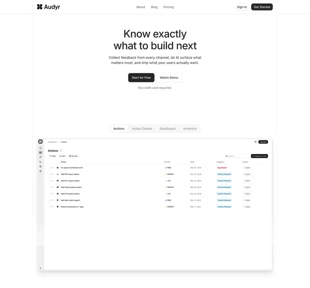
Centered Audyr hero with dual CTAs and a tabbed product screenshot showing the Actions dashboard below the fold.
Summary
A classic Audyr SaaS hero with navbar, oversized centered promise, paired CTAs, and a pill tab bar revealing a detailed Actions list screenshot.
Visual description
White layout with top nav: Audyr logomark left, About/Blog/Pricing center, Sign In outline and Get Started filled black buttons right. Centered oversized headline "Know exactly what to build next." with gray subcopy about AI-surfaced feedback. Black "Start for Free" and outlined "Watch Demo" buttons sit above small gray "No credit card required." text. Below, a gray pill tab switcher (Actions active, Action Details, Dashboard, Analytics) frames a large app screenshot of a prioritized actions table with priority bars, category tags, and export controls.
Key takeaway
Tabs in the hero let one screenshot slot cover multiple product views without carousel noise. Keeping CTAs monochrome makes the UI preview the only color accent below the fold.
Reuse notes
Strong default for early-stage SaaS with a usable dashboard to show. Tab labels must map to genuinely different screens or the pattern feels decorative.