Preview image. Unlock full-res
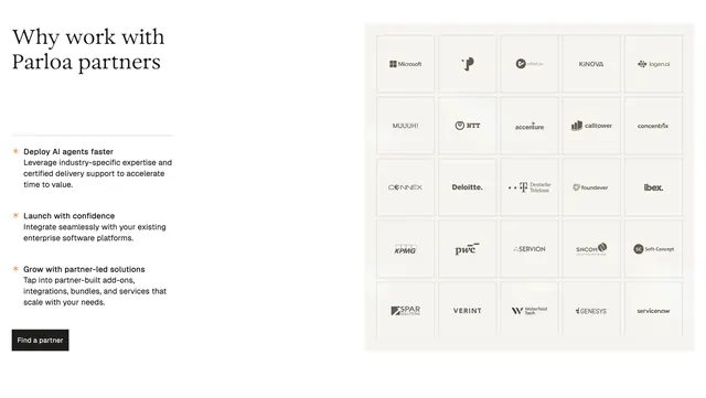
Split section pairing a serif headline and three benefit bullets with a tight 5x5 monochrome partner logo grid on a light background.
Summary
A light, enterprise partner section that sells three integration benefits on the left while a dense white-tile logo wall on the right signals scale and credibility.
Visual description
Off-white page background with generous horizontal padding. Left column leads with a large dark serif headline, "Why work with Parloa partners," followed by three stacked benefit blocks. Each block uses a small orange asterisk bullet, a bold sans-serif subhead, and muted gray body copy covering faster deployment, confident launch, and partner-led growth. A solid black rectangular CTA reading "Find a partner" sits below the list. Right column is a flush 5x5 grid of equal white squares with hairline borders; each cell holds a single partner logo rendered in grayscale or near-black monochrome. Visible brands include Microsoft, Accenture, Deloitte, KPMG, PwC, Genesys, ServiceNow, Deutsche Telekom, and others.
Key takeaway
The split layout that pairs persuasive copy with proof at equal visual weight. Monochrome logos inside a rigid bordered grid keep twenty-five brands readable without color chaos. Orange used only on micro bullets gives accent discipline on an otherwise neutral enterprise palette.
Reuse notes
Strong pattern for B2B SaaS partner or integration pages where trust and ecosystem breadth matter. Works best with enough recognizable logos to fill the grid; sparse sets will feel empty. Serif headline plus sans body fits mature enterprise positioning.