Preview image. Unlock full-res
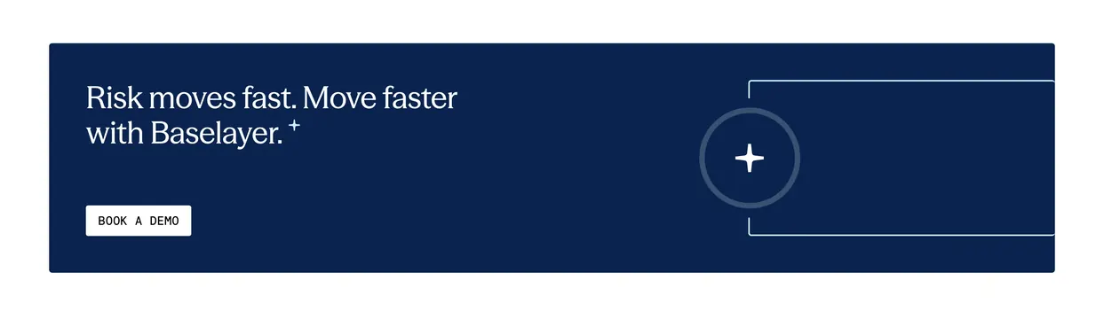
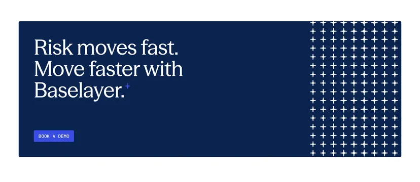
Navy direct-response band with serif headline, blue demo button, and dense white plus-sign grid accent on the right.
Summary
A direct-response CTA on dark navy with left-aligned serif copy, solid blue demo button, and a right-side grid of white plus signs.
Visual description
Deep navy full-bleed section. Left shows white serif headline Risk moves fast. Move faster with Baselayer. ending in a small blue star superscript. Below is a vibrant blue rectangular BOOK A DEMO button with white all-caps sans-serif label. Right third is filled with a tight grid of small white plus symbols roughly eight columns wide spanning full height.
Key takeaway
Plus-grid texture signals data and precision while staying on-brand with Baselayer motifs. Blue filled CTA contrasts clearly against navy where white buttons might feel timid. Short headline plus one button is a pure conversion block.
Reuse notes
Use between content sections or as a closing band before footer. Pattern can drop on mobile to preserve button prominence. Pair with lighter sections above and below for contrast.