Preview image. Unlock full-res
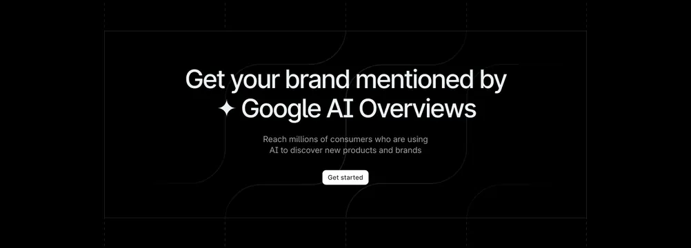
Wide dark CTA banner with a left-aligned two-line headline and a right-aligned light plus dark button pair, edge to edge.
Summary
A minimal full-width CTA banner on near-black, with a confident two-line headline pinned left and two buttons pinned right, nothing else in the frame.
Visual description
A wide dark, almost-black band with a barely-there top-down gradient. On the left, a left-aligned two-line headline in clean white sans-serif reads "Plan the present." over "Build the future." On the far right, vertically aligned with the second line, two pill buttons sit together: a light/white "Get started" and a dark "Talk to sales". There is no imagery, no subhead, and a lot of empty space between the headline and the buttons, giving the band a calm, horizon-like feel.
Key takeaway
Splitting the headline and the buttons to opposite ends of a wide band, with the buttons tracking the lower line, turns a plain CTA into a balanced composition driven entirely by negative space. The two-sentence headline does the emotional work alone.
Reuse notes
A polished closing CTA for a premium developer or productivity product that can carry an austere, type-only look. Works only on dark and only at full width, where the horizontal gap reads as intentional. Keep the copy to two short lines or the balance breaks.