Preview image. Unlock full-res
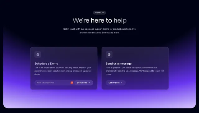
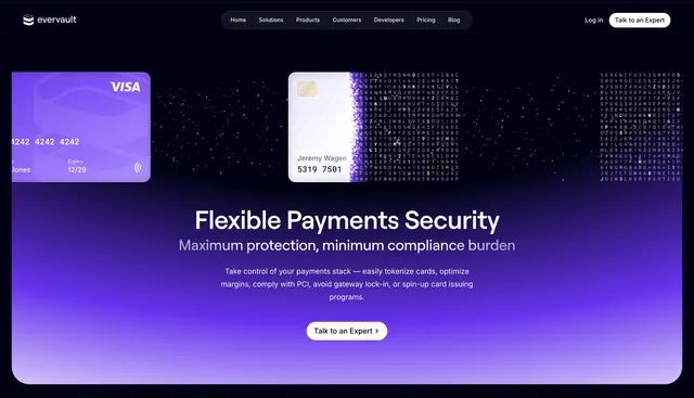
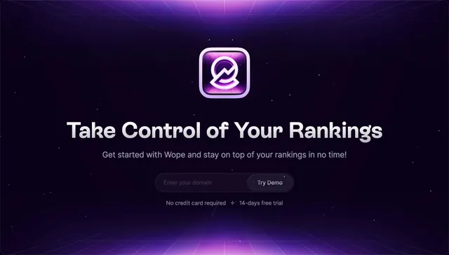
Centered dark CTA on a rounded panel where a vivid violet gradient washes up from the bottom behind an oversized headline, one line of copy, and a dual button pair.
Summary
A contained dark CTA panel whose entire visual hook is a saturated violet gradient rising from the bottom edge behind an oversized two-line headline and a primary plus text-link button pair.
Visual description
The section sits in a rounded-corner panel on a near-black page. The top of the panel is dark and the lower two-thirds fill with a bright violet-to-lavender gradient that glows upward and softens to white at the very base. An oversized two-line headline ("Enhance customer experience and maximize revenue with your payments.") spans the upper area in light type, followed by two centered lines of muted sub-copy. Below sits a white pill primary button labeled Book a demo with a chevron, beside a plain white Try for free text link. Everything is center-aligned.
Key takeaway
A single bottom-up gradient on a contained panel turns an ordinary CTA into the most colorful moment on the page without any imagery. The hard pill button next to a quiet text link keeps one clear primary action.
Reuse notes
Drop-in closing CTA for a dark fintech or SaaS page; the rounded containment lets it sit on any dark background. Relies entirely on the gradient for interest, so the headline must be short and the copy minimal. Dark only.