Preview image. Unlock full-res
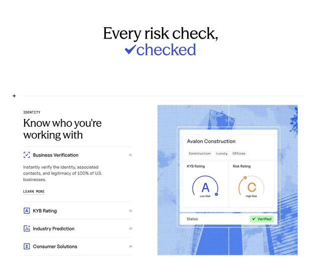
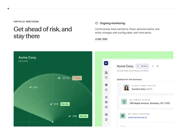
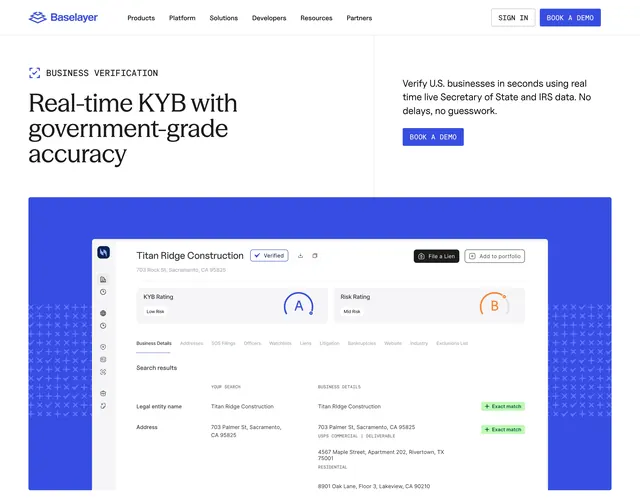
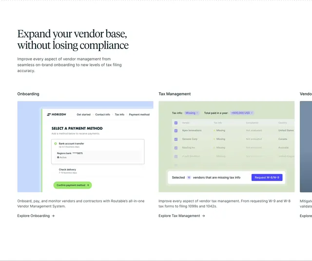
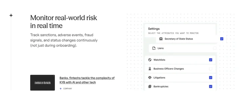
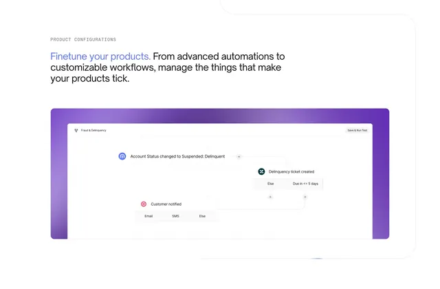
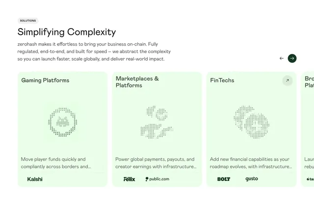
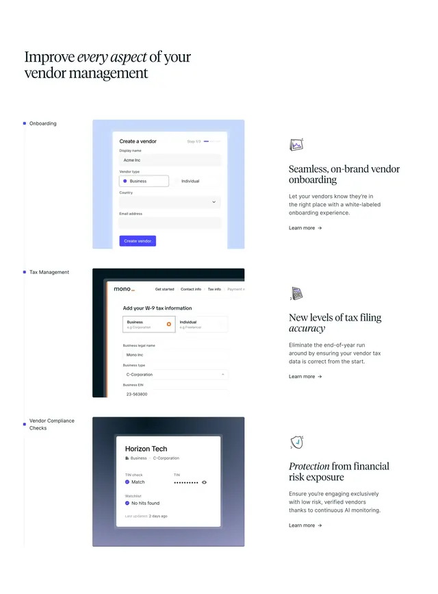
Three horizontal feature rows each pair a colored UI mockup with a labeled headline, description, and arrow CTA.
Summary
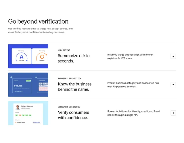
A stacked feature list under "Go beyond verification" walks through KYB rating, industry prediction, and consumer solutions with product screenshots in tinted containers.
Visual description
White background with left-aligned serif section title and gray intro line. Three rows separated by thin gray rules each use four zones: a blue-tinted UI vignette (A/C risk rings, NAICS and keyword cards, or a person profile with litigation count), a small all-caps label plus serif subhead, a sans-serif benefit sentence, and a square arrow button at the far right.
Key takeaway
Repeating row grammar scales to many capabilities without redesigning each block. Color-coded mockup wells differentiate features while typography stays constant. Arrow-only buttons keep rows compact.
Reuse notes
Ideal for onboarding or platform overview pages listing API-powered capabilities. Each row needs a distinct product screenshot. Long copy may wrap awkwardly on narrow viewports.