Preview image. Unlock full-res
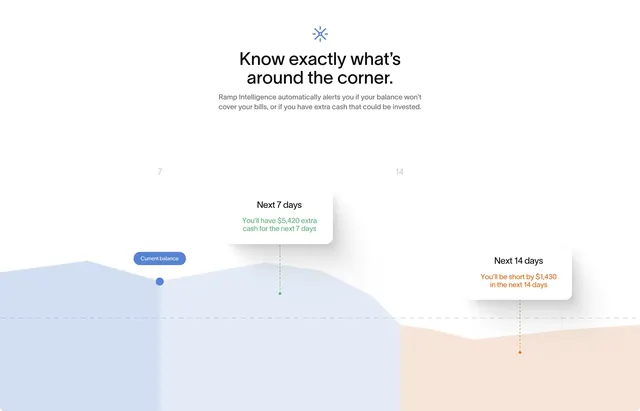
White feature block with headline and an area chart showing surplus green and shortfall orange alerts at 7 and 14 days.
Summary
White feature block with headline and an area chart showing surplus green and shortfall orange alerts at 7 and 14 days.
Visual description
White canvas with blue spark icon, bold headline Know exactly what's around the corner, and grey subcopy on Ramp Intelligence balance alerts. Below, a soft area chart transitions from blue above a dashed zero line to peach below. Floating white cards at day 7 show green You'll have $5,420 extra cash and at day 14 orange You'll be short by $1,430, each linked by dashed vertical lines to chart dots.
Key takeaway
Semantic color on the chart fill (blue healthy, peach danger) plus matching tooltip cards makes forecasting feel actionable without a dense dashboard. Day markers 7 and 14 give concrete planning horizons.
Reuse notes
Strong for finance or ops products selling proactive alerts. Requires believable numbers and readable chart at smaller breakpoints.