Preview image. Unlock full-res
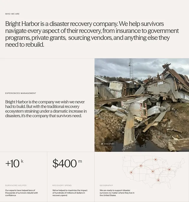
Cream about block with WHO WE ARE intro, split mission copy and disaster photo, and a three-column stats row with a US map.
Summary
Editorial about section stating Bright Harbor is a disaster recovery company, pairing mission copy with storm-debris photography and three metrics including survivors helped and recovery spend.
Visual description
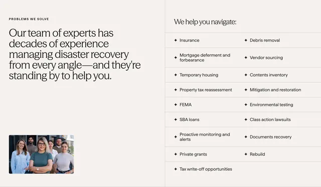
Warm cream background. Top: small WHO WE ARE label and large serif paragraph on insurance, FEMA, vendors, and rebuild scope. Middle split: left EXPERIENCED MANAGEMENT copy; right photo of tornado wreckage with dark "OUR STORY" play pill. Bottom three columns divided by thin vertical rules: +10k survivors helped, $400m recovery spend, and geography column with US line map and red node network.
Key takeaway
Serif story block plus sans caps labels create calm authority. One disaster photo with play control beats a generic team shot for this category. Map column makes geography tangible without a long list.
Reuse notes
For mission-driven B2B with credibility stats. Numbers need sourcing. Photo choice is emotionally heavy; tone must match brand sensitivity.