Preview image. Unlock full-res
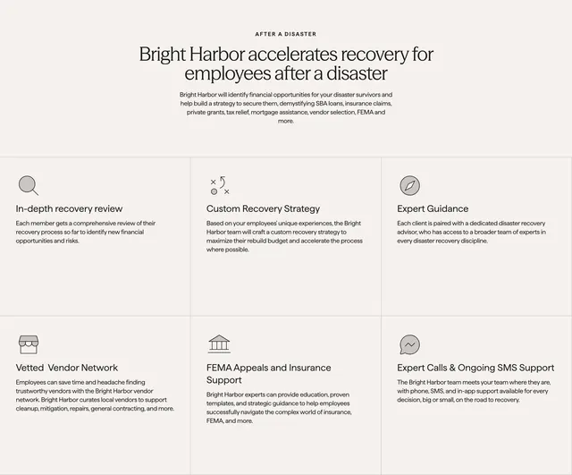
Centered AFTER A DISASTER headline above a ruled 3x2 grid of six recovery benefits with line icons.
Summary
Centered copy introduces Bright Harbor for employees after disaster, then a six-cell grid covers review, strategy, guidance, vendors, FEMA support, and SMS help.
Visual description
Cream background. Top center: AFTER A DISASTER label, large serif headline on accelerating employee recovery, gray paragraph on SBA, insurance, and FEMA funding. Below, thin gray grid lines form six equal blocks each with a small line icon, bold sans title, and short description covering recovery review, custom strategy, expert guidance, vetted vendors, FEMA and insurance support, and calls plus SMS.
Key takeaway
Hairline grid instead of cards keeps a serious topic from feeling like a SaaS feature wall. Centered employer framing makes the section reusable on HR landing pages.
Reuse notes
For B2B2C or employee-benefit pitches. Icons must stay simple and uniform. Six tiles is a practical max before scan fatigue on mobile.
More value proposition sections
See all
More like this
Keep what you find
A free account saves references to boards and can send you a weekly email of picks based on what you save.
To see every result, go Pro.