Preview image. Unlock full-res
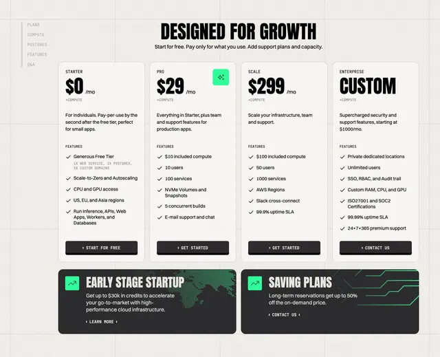
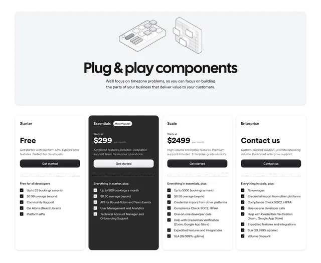
Light monochrome four-tier pricing with a display headline in a grey panel and one dark Most Popular card among three white plan cards.
Summary
A light, monochrome four-tier pricing section introduced by an oversized "Plug & play components" headline set in a soft grey panel with two 3D line-art icons. The defining move is the single dark "Essentials" card flagged Most Popular standing out among three white cards.
Visual description
A rounded light-grey banner spans the top, holding two thin 3D wireframe component icons and a large bold display headline, "Plug & play components", with a two-line centered subhead. Below sit four equal pricing columns: Starter (Free), Essentials ($299/month, rendered as a dark near-black card with a "Most Popular" pill), Scale ($2499/month), and Enterprise (Contact us). Each card carries a name, price, one-line descriptor, a full-width dark or light "Get started"/"Contact us" button, and a checklist of features prefixed with small square check icons under a "Free for all developers" or "Everything in [tier], plus" lead-in. The dark Essentials card inverts the palette to draw the eye to the recommended plan.
Key takeaway
Promoting one plan purely by inverting its card to dark while the rest stay white, which highlights the recommended tier without color. The grey intro panel with light 3D line-art icons gives a pricing block a real header instead of a bare title.
Reuse notes
Good for a developer platform with four clearly separated tiers and per-usage limits. Four columns get tight on narrow screens, so plan the responsive stack. The strict black-white-grey palette keeps focus on numbers and feature lists, easy to reskin to a brand accent.