Preview image. Unlock full-res
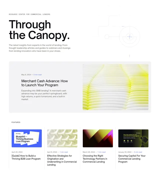
Light blog index header with oversized title, featured hero article card, and a four-column featured posts row.
Summary
A blog landing header that pairs a large "Through the Canopy" title with a wide featured article card and a four-up row of smaller featured posts.
Visual description
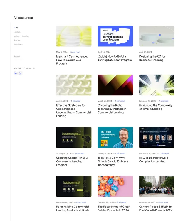
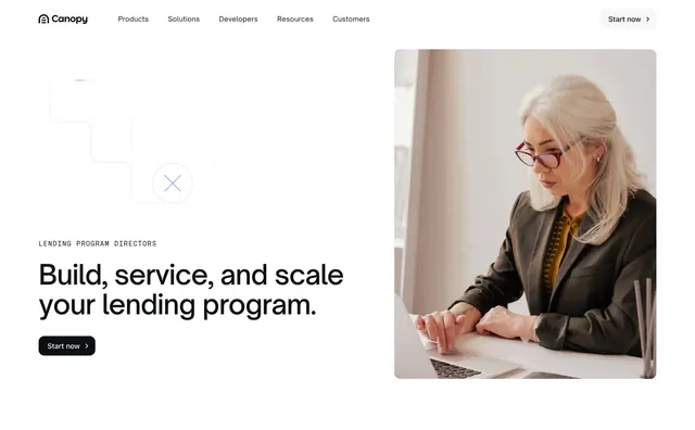
White background with generous padding. A small gray all-caps eyebrow reads "Resource Center for Commercial Lenders" above an oversized black headline. To the right, a faint grid with a thin crosshair circle graphic adds technical texture. Below, a light gray rounded card splits horizontally: left holds date, read time, bold title, and excerpt; right shows a rounded abstract 3D render with warm yellow lighting. A "Featured" label introduces four equal vertical cards, each with a rounded thumbnail, metadata line, and bold article title.
Key takeaway
The two-tier featured hierarchy: one dominant hero article card, then a compact four-column row for secondary picks. Abstract 3D thumbnails keep the grid visually varied without relying on stock photography.
Reuse notes
Works for B2B content hubs that need editorial weight without a heavy magazine layout. Needs strong thumbnail art to carry the lower row. Best on light backgrounds with muted gray card fills.