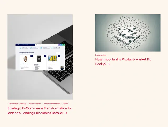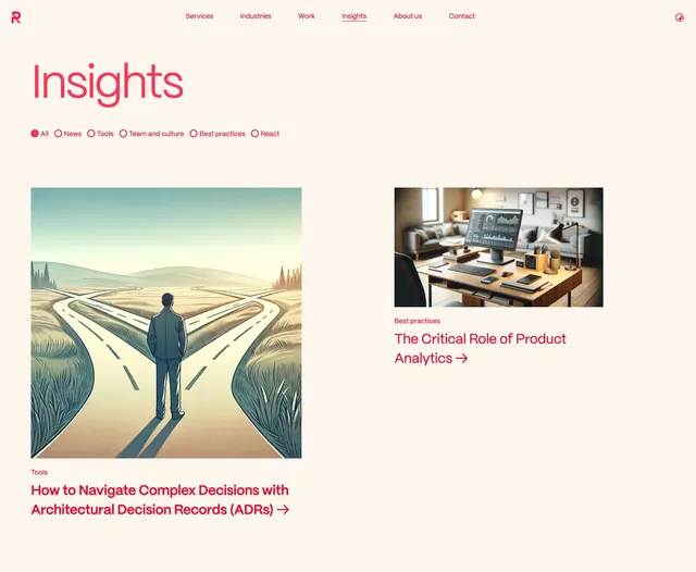
Preview image. Unlock full-res
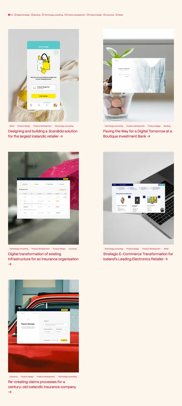
Light editorial blog hero with oversized coral headline, radio-style category filters, and an asymmetric two-up article grid.
Summary
Light editorial blog hero with oversized coral headline, radio-style category filters, and an asymmetric two-up article grid.
Visual description
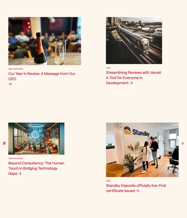
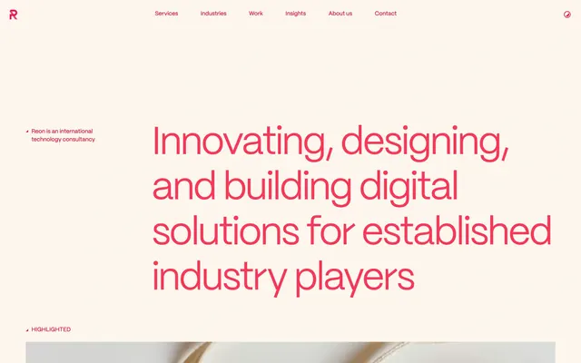
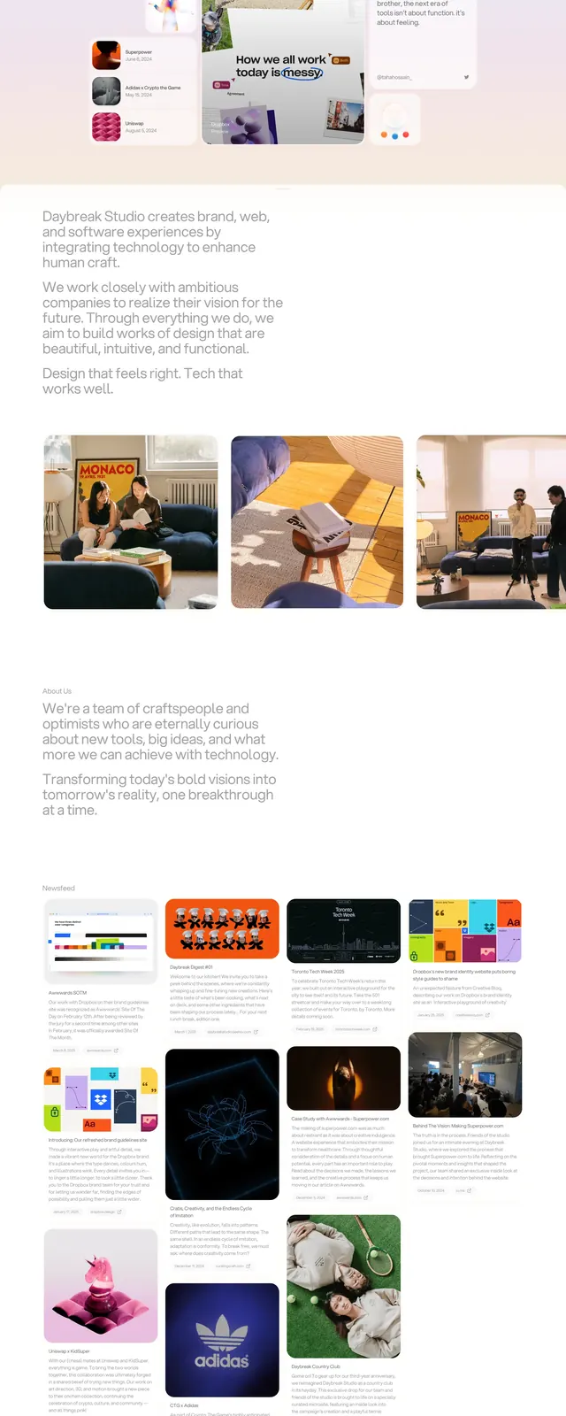
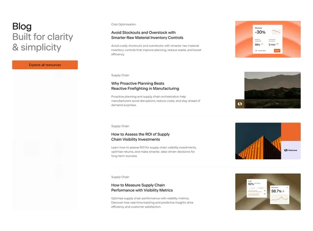
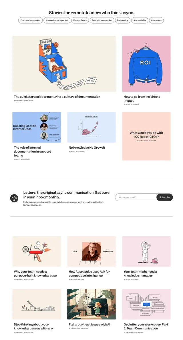
Warm off-white page with a slim top nav: coral R logo left, centered text links with Insights underlined, and a small circular toggle right. Below, an oversized left-aligned Insights headline in coral-red. A horizontal category filter row sits beneath with All selected via a filled red circle and empty circle outlines for News, Tools, Team and culture, Best practices, and React. Two article cards follow in an uneven two-column grid: a large left card with a square editorial illustration of a figure at a fork in the road, a Tools label, and a bold headline ending in an arrow; a smaller right card with a 3D home-office render, Best practices label, and arrow headline.
Key takeaway
The radio-circle category filter as a lightweight editorial nav pattern. Pair an oversized page title with an asymmetric article grid so one featured story dominates without feeling like a carousel.
Reuse notes
Strong pattern for agency or consultancy insight/blog index pages. Works when you have illustration and photography mix. The coral-on-cream palette needs consistent brand color discipline across the site.