Preview image. Unlock full-res
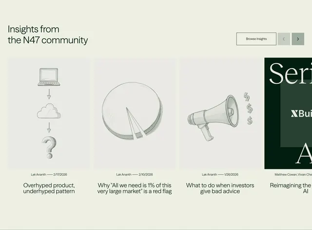
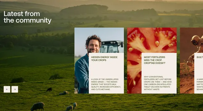
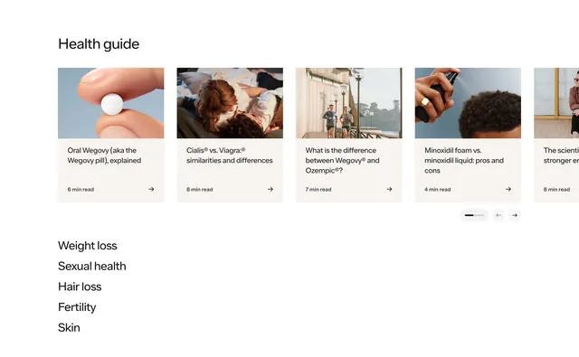
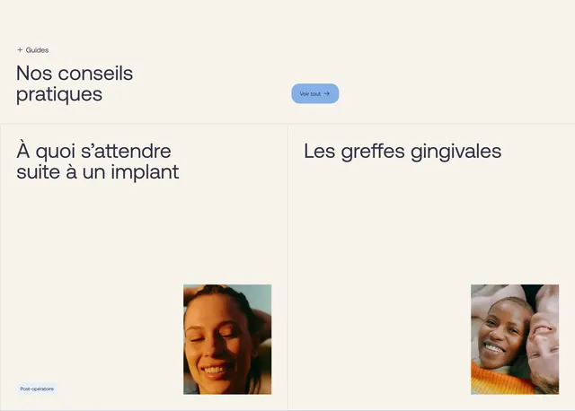
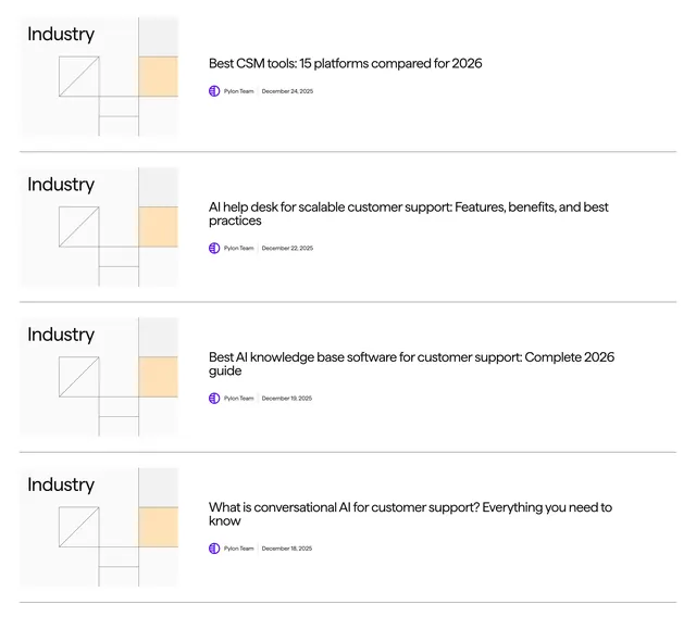
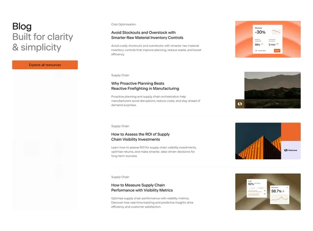
Split blog index with left sticky headline, orange explore button, dot-grid texture, and right stacked post rows with thumbnails.
Summary
Editorial blog preview pairing a left column "Blog" masthead with gray tagline and orange CTA against a four-row linked post list with category labels and thumbnails.
Visual description
White page split roughly one-third left. Left stack shows bold black "Blog," large gray "Built for clarity & simplicity," orange rectangular "Explore all resources" button, and tall light-gray dot-grid decorative block. Right column lists four posts separated by thin rules: gray category tags like Cost Optimisation or Supply Chain, bold titles, short excerpts, and right-aligned rectangular thumbnails mixing orange UI graphics, mountain photo, container collage, and dashboard cards with percentage metrics.
Key takeaway
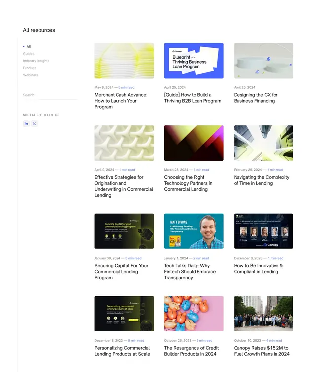
Treat the blog index like editorial layout, not a card grid: category, title, excerpt, thumbnail in a scannable row. Dot-grid filler adds texture without photography.
Reuse notes
Strong for content-heavy B2B sites prioritizing readability. Thumbnail aspect ratio should stay consistent to keep rows aligned.