Preview image. Unlock full-res
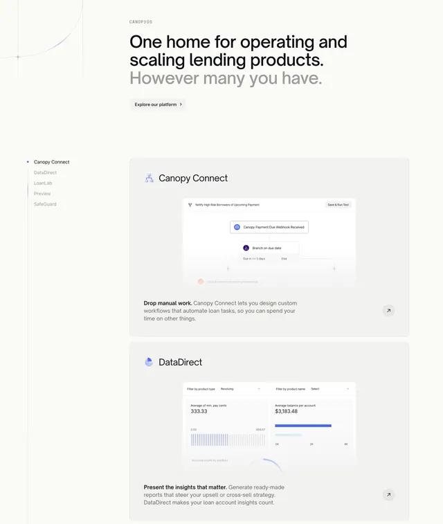
Light feature section with a sticky left nav of product modules and large stacked cards on the right showing product UI screenshots.
Summary
A light features section that anchors a sticky list of product modules on the left while large feature cards scroll on the right, each showing a real product screenshot. The defining structure is the sidebar-nav-plus-stacked-cards pairing.
Visual description
A grey "CANOPYOS" eyebrow tops a two-tone headline, "One home for operating and scaling lending products." in black with "However many you have." in light grey, followed by a small light "Explore our platform" pill with an arrow. A faint thin curve decorates the top-left corner. Below, a left column lists module names as a vertical nav (Canopy Connect highlighted with a dot, then DataDirect, LoanLab, Preview, SafeGuard in grey). The right side stacks large light rounded cards: a "Canopy Connect" card with a workflow-automation UI screenshot and a bold-lead-in caption ("Drop manual work."), and a "DataDirect" card with an analytics dashboard screenshot (filters, average balance figures, a bar chart) and its own caption. Each card has a small circular arrow button in its corner.
Key takeaway
The sticky module list that doubles as section navigation while the matching feature cards scroll past, tying name to screenshot. The bold-lead-in sentence opening each caption ("Drop manual work.") for a quick scannable hook before the explanation.
Reuse notes
Best for a multi-module platform where each product needs its own screenshot and short pitch. Requires genuine, legible product UI to fill the large cards. The sticky nav pattern shines on long scrolls but needs a sensible mobile fallback where the sidebar collapses.