Preview image. Unlock full-res
Light bento feature section pairing a large product-config mockup with a 2x2 grid of feature blurbs, each carrying its own UI snippet.
Summary
A light feature section that leads with a wide product-configuration mockup, then drops into a 2x2 grid of short feature blurbs, each illustrated by a small slice of real UI.
Visual description
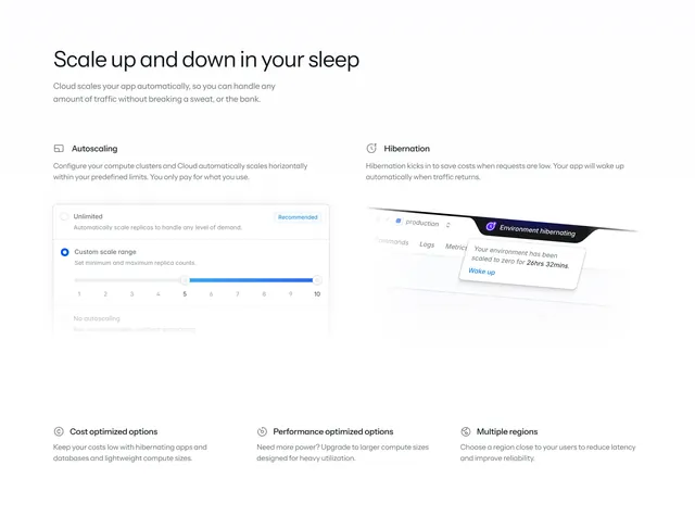
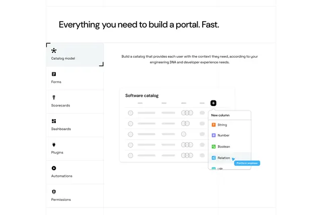
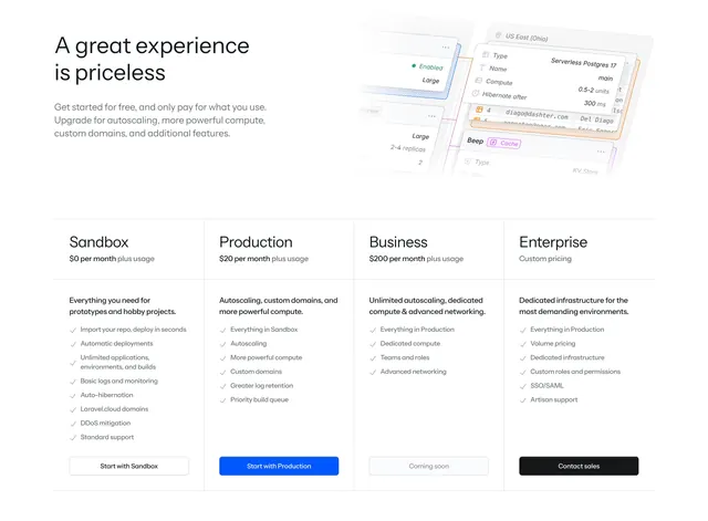
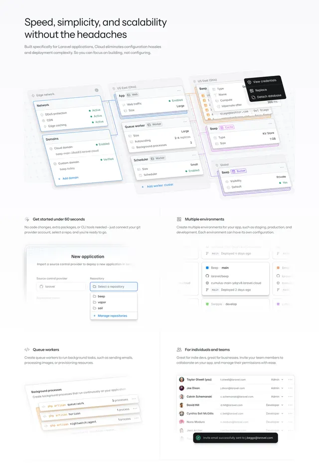
Off-white background. A two-line headline "Speed, simplicity, and scalability without the headaches" sits top-left over a short paragraph. Below it a large composed mockup shows overlapping config cards (Edge network, Domains, App/Web, Queue worker, Scheduler, cache/bucket) connected by faint lines, with a dark context menu (View credentials, Replace, Detach database) floating over one card. Underneath, a four-up arrangement reading as two rows of two: each feature (Get started under 60 seconds, Multiple environments, Queue workers, For individuals and teams) has a small monochrome icon, a bold title, a sentence of copy, and a cropped UI fragment (a repository dropdown, an environment list, terminal-style process lines, a team permissions table with a green success toast).
Key takeaway
Every feature claim is grounded by a real piece of product UI rather than an abstract illustration, which sells a technical tool convincingly. The big connected-cards hero mockup communicates "one dashboard, many services" at a glance before any feature copy is read. The icon plus title plus snippet rhythm keeps a dense grid scannable.
Reuse notes
Best for a developer platform with genuinely screenshot-worthy UI, since the section lives or dies on the quality of those fragments. Pairs naturally after a hero and before pricing. The connected-cards mockup is reusable anywhere you need to imply an integrated control plane.