Preview image. Unlock full-res
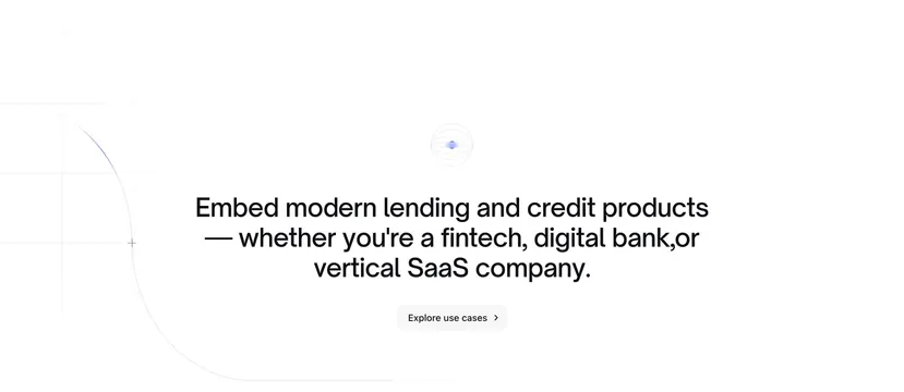
Centered light CTA with concentric-circle icon, bold headline for fintech audiences, and a gray explore button.
Summary
A spacious light CTA that centers an abstract icon and a long headline targeting fintechs, digital banks, and vertical SaaS companies.
Visual description
White background with faint gray grid at left and a thin blue curved line entering from the mid-left. Centered small icon of concentric gray circles with a soft blue glowing core. Large bold black centered headline about embedding modern lending products for three audience types. Light gray pill button below reads "Explore use cases >". No imagery or secondary links.
Key takeaway
Naming three audience segments directly in the headline so visitors self-select without a dropdown. The concentric icon and single curved line add technical flavor with almost no visual weight.
Reuse notes
Mid-page bridge between product features and industry pages. Headline length needs careful line breaks on mobile. Pairs with the site's light grid motif used in heroes and side sections.