Preview image. Unlock full-res
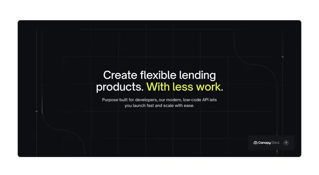
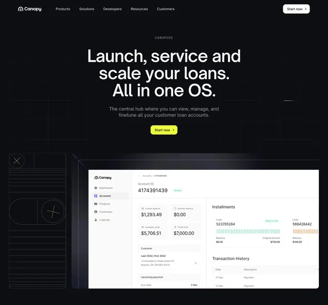
Dark grid hero for CanopyOS with centered copy, lime CTA, navbar, and a large accounts dashboard mockup below.
Summary
A dark-mode product hero for CanopyOS that centers OS positioning copy above a full-width light UI screenshot of the accounts dashboard.
Visual description
Dark charcoal background with faint grid. Navbar with white logo, gray nav links, and light gray "Start now" pill. Centered gray all-caps "CanopyOS" label, large white headline about launching and servicing loans in one OS, lighter gray subcopy on managing customer loan accounts, and a lime-green "Start now >" pill button. Bottom half shows a large light-mode dashboard mockup in a dark frame: sidebar with Dashboard, Accounts, Products, Customers, LoanLab; balance and credit metric cards; installment bar chart; transaction history table. Thin wireframe mobile graphic with plus and x circles sits left of the mockup.
Key takeaway
Placing the full product screenshot directly under centered dark copy so the OS claim is immediately verifiable. Lime CTA on dark grid matches the homepage language while the light UI mockup provides contrast.
Reuse notes
Default for a flagship product landing hero. Mockup must be current and legible at full width. Wireframe accent is optional garnish; remove if it competes with the screenshot on smaller viewports.