Preview image. Unlock full-res
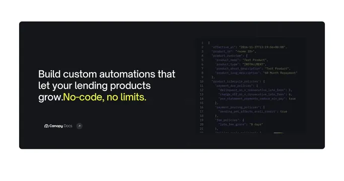
Dark centered developer CTA with lime-accent headline and a floating Canopy Docs link card in the corner.
Summary
A developer-focused dark band that centers API positioning copy and places the docs entry point as a small floating card at the bottom right.
Visual description
Black background with faint grid, thin curved pale lines, and small plus accents. Centered white headline with lime-yellow emphasis on "With less work." Gray-white subcopy below describes a low-code API for developers. Bottom-right corner holds a dark gray rounded card with arch icon, "Canopy Docs" label, and arrow-in-circle link affordance. No primary filled button in the center.
Key takeaway
Treating documentation as the primary action via a corner card instead of a centered button, which suits developer audiences who expect a docs path. Lime emphasis on only the efficiency payoff phrase.
Reuse notes
Pair after product feature sections targeting builders. The corner docs card needs consistent iconography with other doc links on the site. Requires established dark grid motif to feel cohesive.