Preview image. Unlock full-res
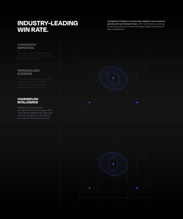
Dark split feature section with vertical feature list left and stacked blue pulse-ring data visualizations right on a faint grid.
Summary
A dark "Industry-Leading Win Rate" section combining a three-item vertical feature list with duplicate abstract pulse-ring graphics on a subtle grid.
Visual description
Black background. Top-left shows a large white all-caps headline; top-right holds a gray introductory paragraph about Chargeflow Intelligence adapting to policies and card network rules. Left sidebar lists three features separated by thin horizontal rules: "Constantly Improving" and "Personalized Evidence" appear dimmed gray with subtext; "Chargeflow Intelligence" is bright white as the active item with a longer description. Right half stacks two identical graphics: a bright blue center dot with wobbly concentric blue rings and faint dotted node circles at grid intersections, all over a thin gray grid.
Key takeaway
Using dimmed versus bright list items to signal an active feature state without tabs or carousel. The duplicated pulse-ring motif reinforces an AI-signal metaphor while staying abstract enough for any data product.
Reuse notes
Strong for AI or analytics product pages explaining layered capabilities. The dark grid background needs sufficient contrast on inactive list items. Works best when one feature is clearly highlighted at a time.