Preview image. Unlock full-res
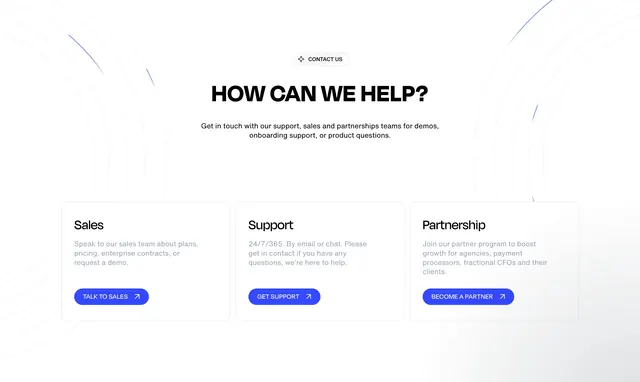
Light centered contact hub with How can we help headline and three equal cards for Sales, Support, and Partnership each with blue pill CTA.
Summary
A white contact section with Contact Us badge, "How can we help?" headline, intro copy, and three cards routing to Sales, Support, and Partnership teams.
Visual description
White background with faint light-gray concentric arcs from top corners. Centered pill badge with star icon "Contact us." Large black headline "How can we help?" Gray centered subcopy on demos, onboarding, and product questions. Three equal white cards with thin gray borders and rounded corners in a row. Each card: bold title (Sales, Support, Partnership), gray description paragraph, blue pill button ("Talk to sales," "Get support," "Become a partner") with diagonal arrow. Cards share identical structure and spacing.
Key takeaway
One headline plus three parallel intent cards beats a single generic contact form for routing enterprise visitors. Identical card chrome with different CTAs keeps the choice feeling fair, not hierarchical.
Reuse notes
Use on contact pages or help hubs for B2B SaaS with distinct go-to-market paths. Light-only; subtle corner rings add depth without imagery. Swap copy per team but keep button label verbs action-specific.
More contact sections
See all
More like this
Keep what you find
A free account saves references to boards and can send you a weekly email of picks based on what you save.
To see every result, go Pro.