Preview image. Unlock full-res
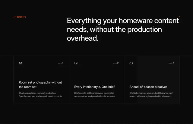
Dark three-column benefits section for homeware content with numbered cards, outline icons, and dot-grid background on black.
Summary
Benefits band for homeware: headline on content without production overhead and three numbered cards on room sets, interior styles, and seasonal creatives.
Visual description
Black background with subtle dark dot grid. Orange "// Benefits" top-left. Large white headline right "Everything your homeware content needs, without the production overhead" with orange corner bracket accent. Three columns separated by thin vertical gray lines. Each card: white outline icon top-left (camera, landscape, cloud), index --- 1/2/3 top-right, white title, gray body. Topics: room set photography without the room set; every interior style from one brief (Scandinavian, maximalist, warm minimal, grandmillennial); ahead-of-season creatives restyling product library.
Key takeaway
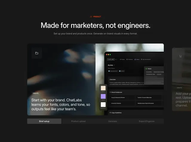
Numbered benefit columns with minimal line icons give editorial rhythm on a dark dot-grid field. Orange slash label and corner bracket repeat ChatLabs section grammar across vertical pages.
Reuse notes
Use for industry-specific benefit rows on interiors or homeware landing pages. Three columns fit desktop; stack with numbers retained on mobile. Swap style examples per vertical.