Preview image. Unlock full-res
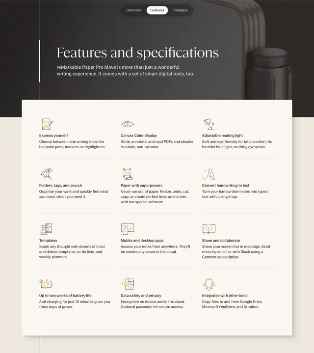
Dark-to-light features section with serif headline over product photography and a twelve-item icon grid on warm white.
Summary
A stacked features section that opens with a dark atmospheric header and transitions into a warm off-white twelve-cell capability grid with line icons and short copy.
Visual description
The top band uses a charcoal background with a blurred product photo of the tablet and stylus on the right. Centered pill tabs read Overview, Features, and Compare, with Features active on white. A thin vertical white rule anchors the left edge beside a large white serif headline, "Features and specifications," and a short sans-serif subline about smart digital tools. Below, the page shifts to a cream-white field arranged as three columns by four rows. Each cell pairs a thin black line icon with orange accent detail, a bold sans-serif title, and one or two lines of supporting text covering writing tools, color display, reading light, organization, templates, apps, collaboration, battery, privacy, and integrations. Subtle horizontal dividers separate rows without boxing each item.
Key takeaway
The dark hero-to-light grid transition gives specs page energy without abandoning the brand's calm palette. Uniform icon-plus-title-plus-blurb cells scale cleanly to a dozen points while staying scannable.
Reuse notes
Strong pattern for hardware or premium consumer product detail pages that need many capabilities in one view. Pair the pill tab bar with adjacent Overview and Compare pages for a cohesive product hub. Works best when icons stay single-weight and copy stays to one sentence per cell.